All work 01 Visual Identity
UBATUTUBA®
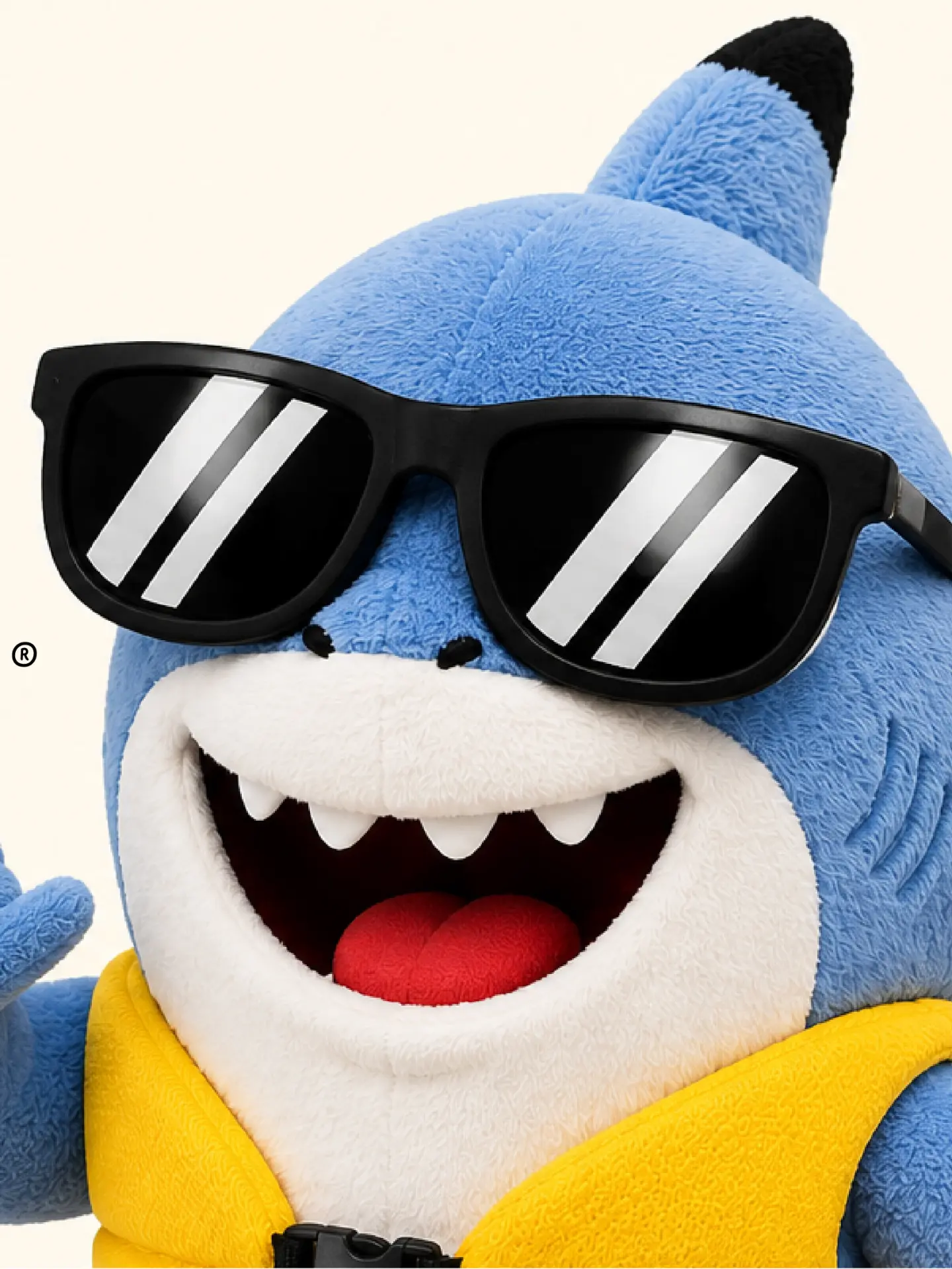
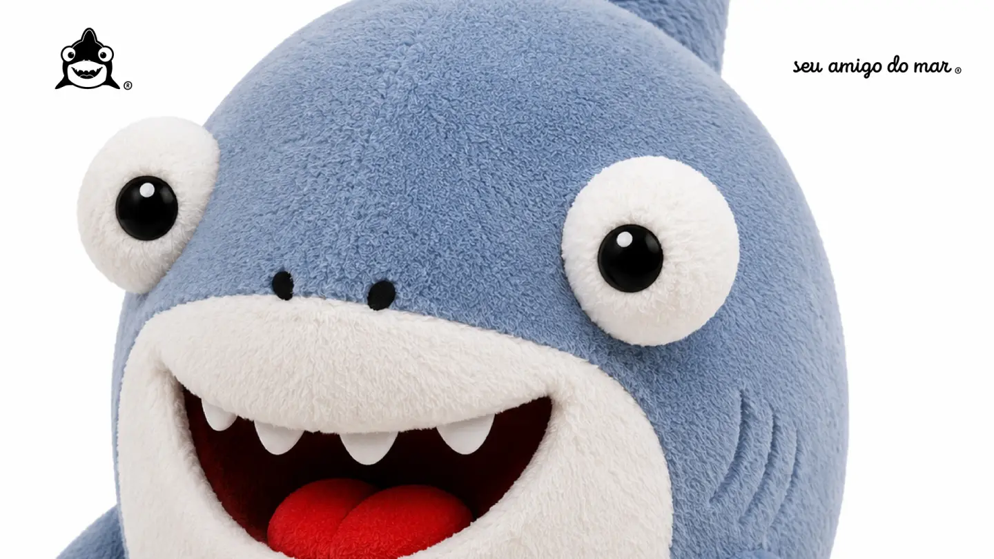
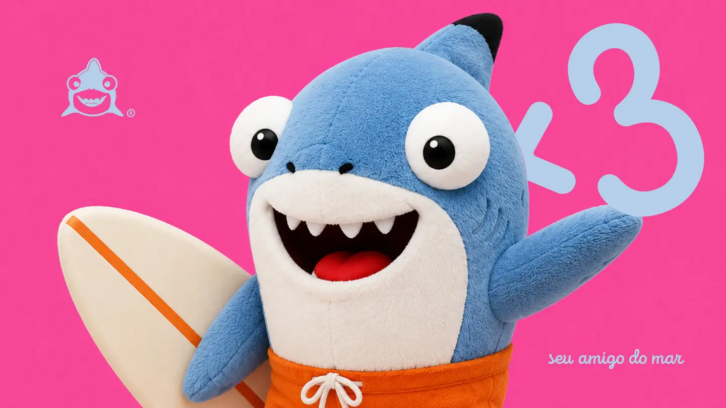
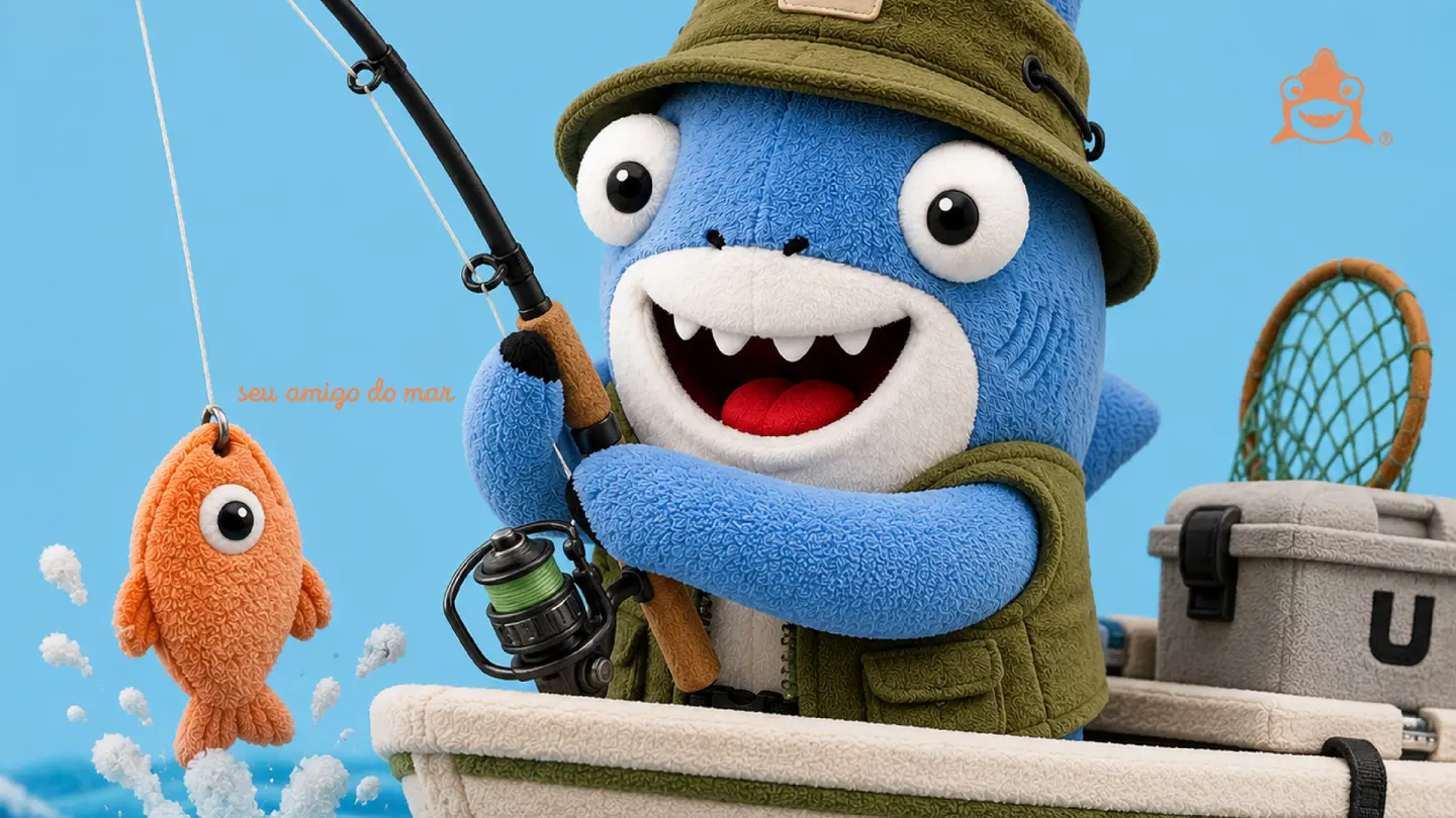
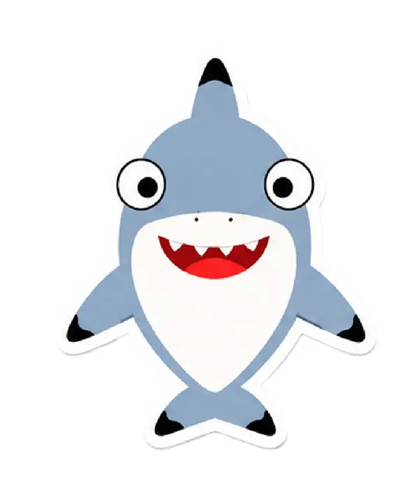
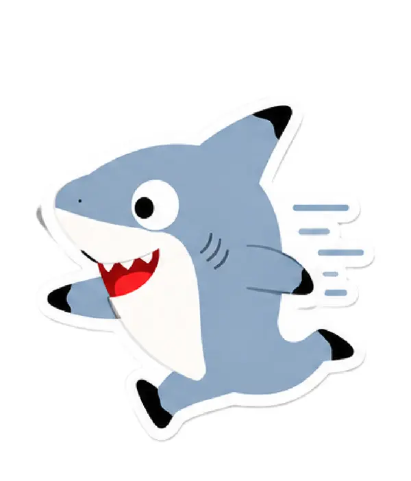
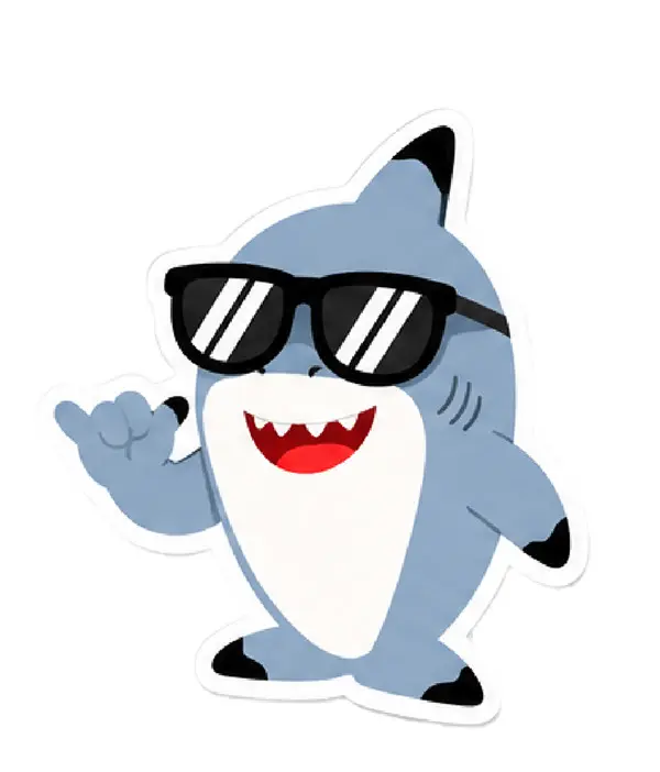
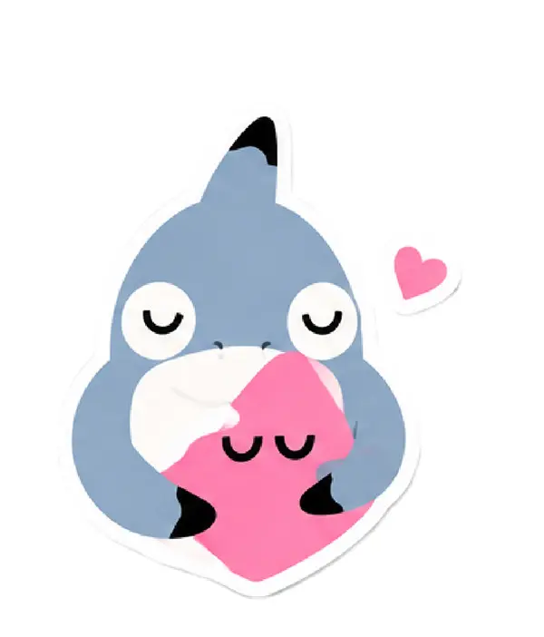
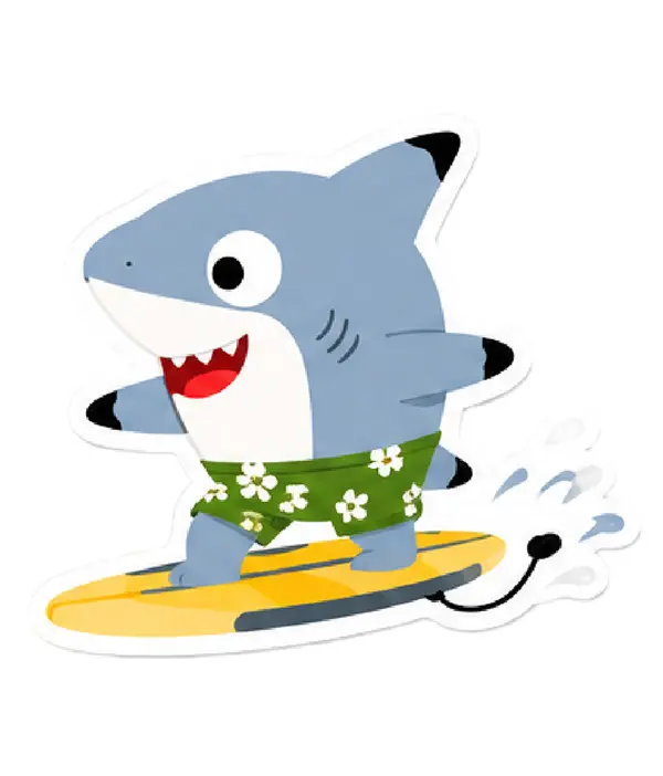
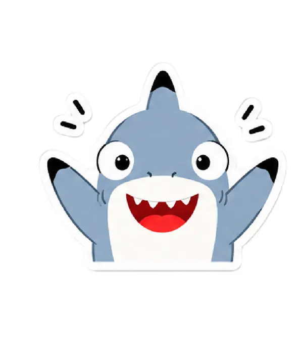
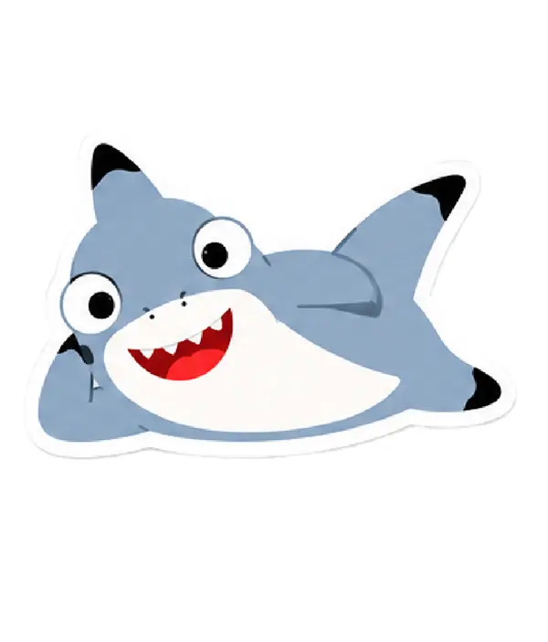
UBATUTUBA starts from the challenge of turning an affectionate symbol of the Brazilian coast into intellectual property with real commercial potential: a charismatic shark, born on the beaches of Ubatuba, conceived not as a campaign but as a brand of its own — with character, product, sales channel and business model from the first stroke.
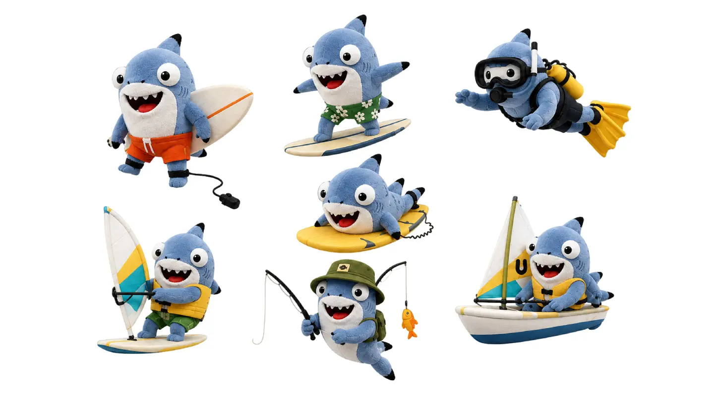
More than creating a mascot, the project takes on the job of building a universe: a character with the soul of a place — the capital of Brazilian surf — and the heart of a licensable brand, able to sustain a physical product line, a digital presence of its own and, ahead, a structure ready to receive capital. The system starts from a strategic decision: leave the territory of the "souvenir product" — a commodity, seasonal, with no competitive defense — for the territory of entertainment and coastal lifestyle IP, where character, purpose (local production, artisanal economy, conscious materials) and commercial execution move together from day zero.
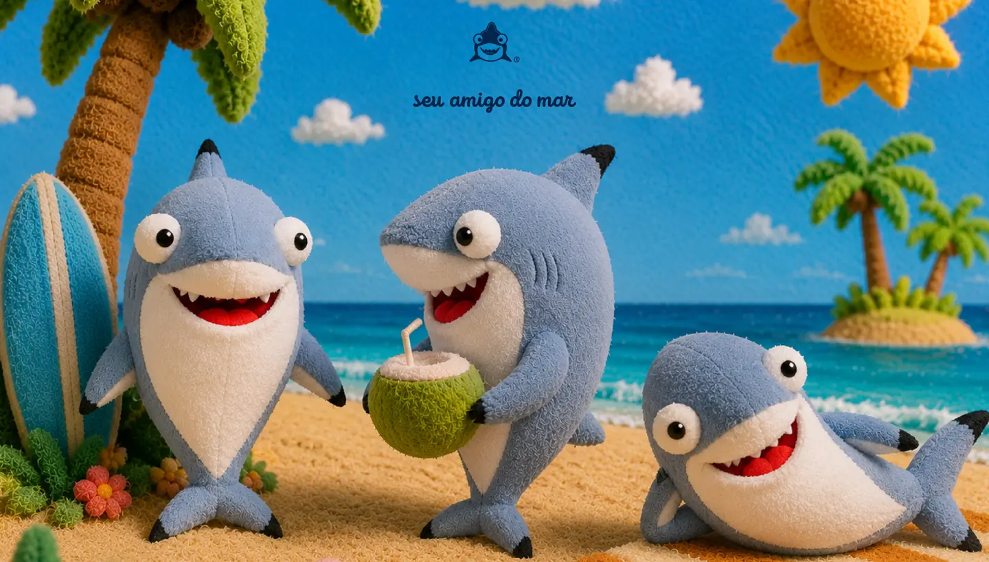
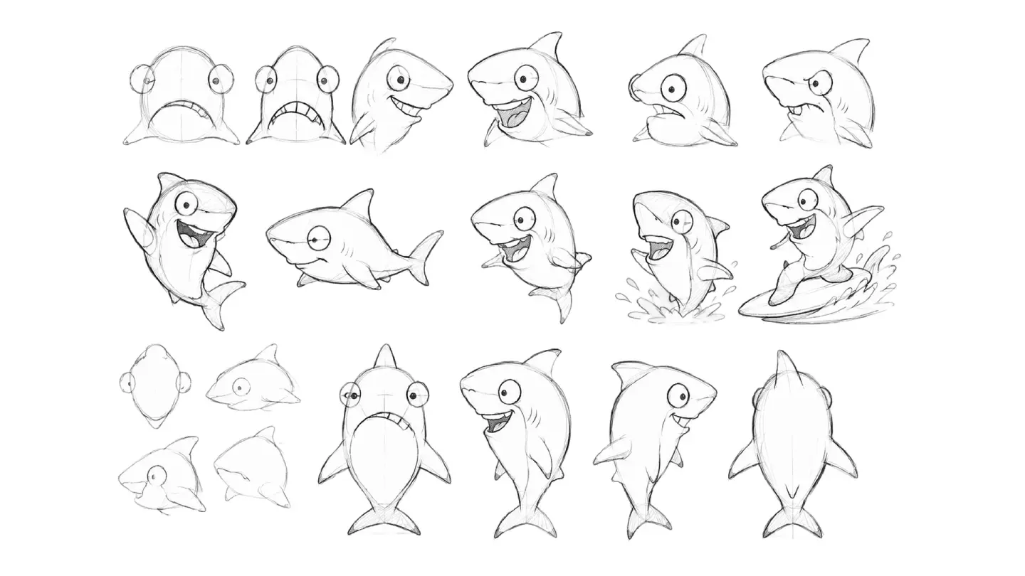
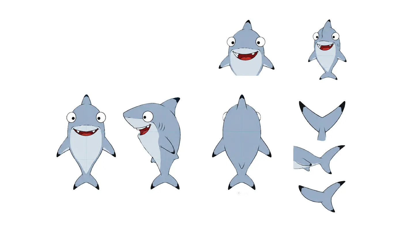
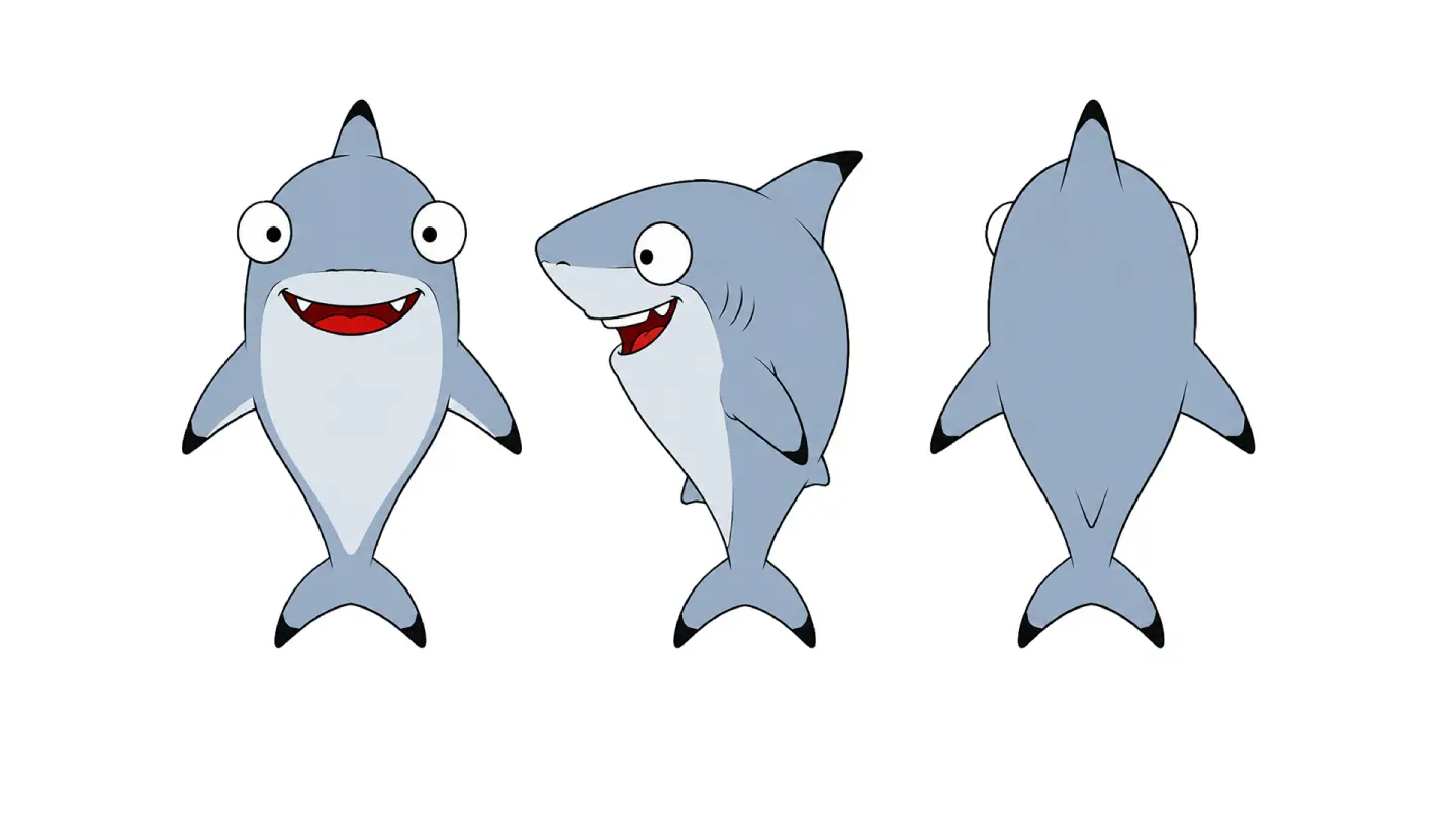
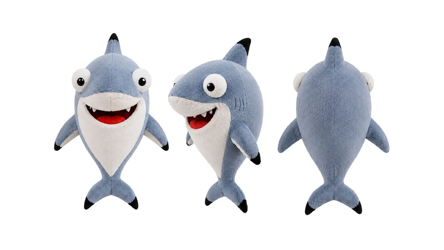
The system develops on parallel fronts
Brand & Character
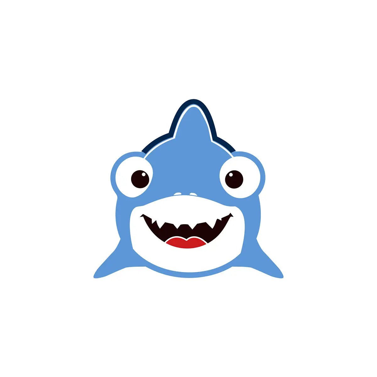
UBATU TUBA's verbal and visual identity — name, tone of voice, graphic expression — built to work on a keychain as well as in a shop window.
Product & Prototyping
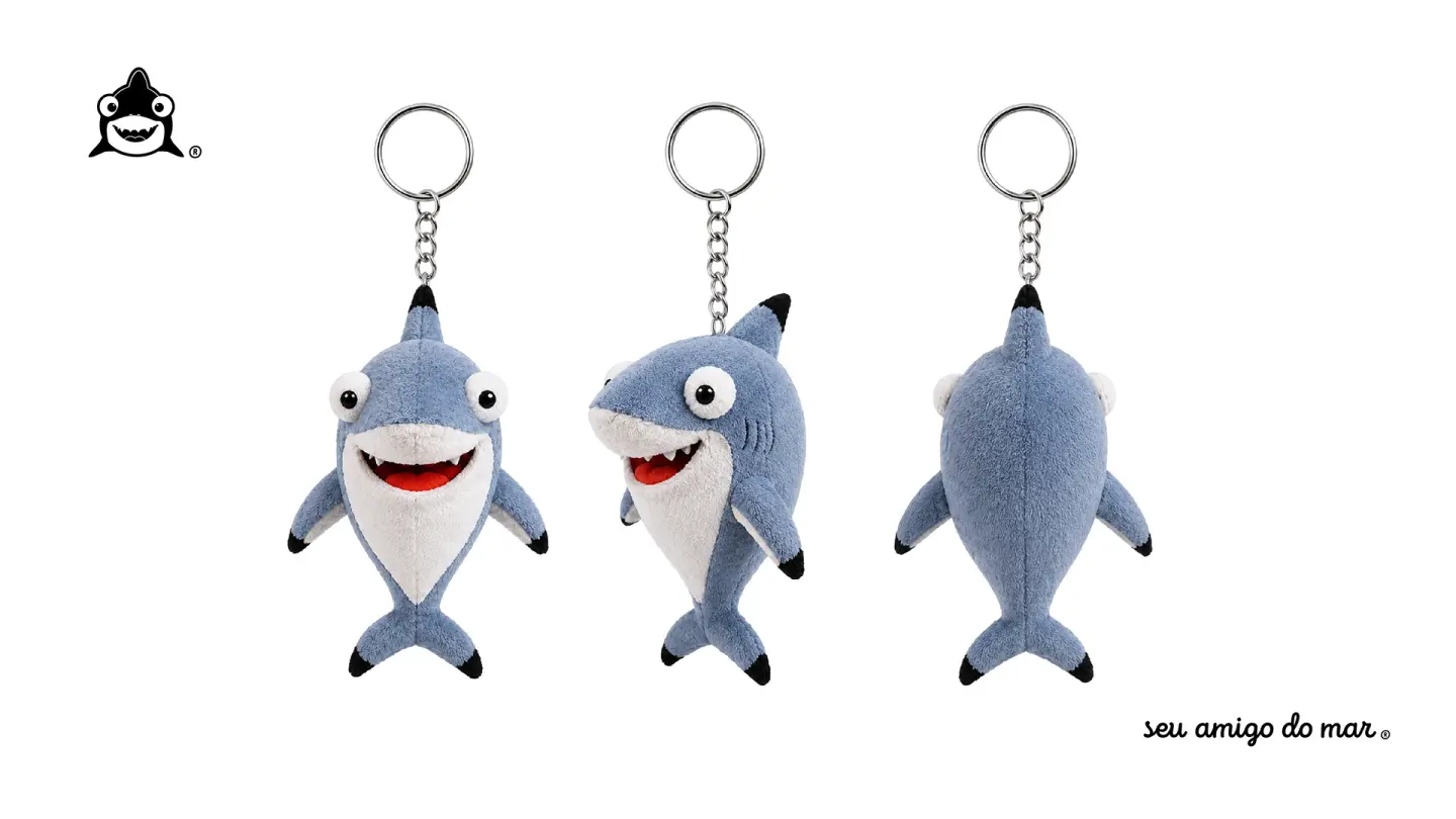
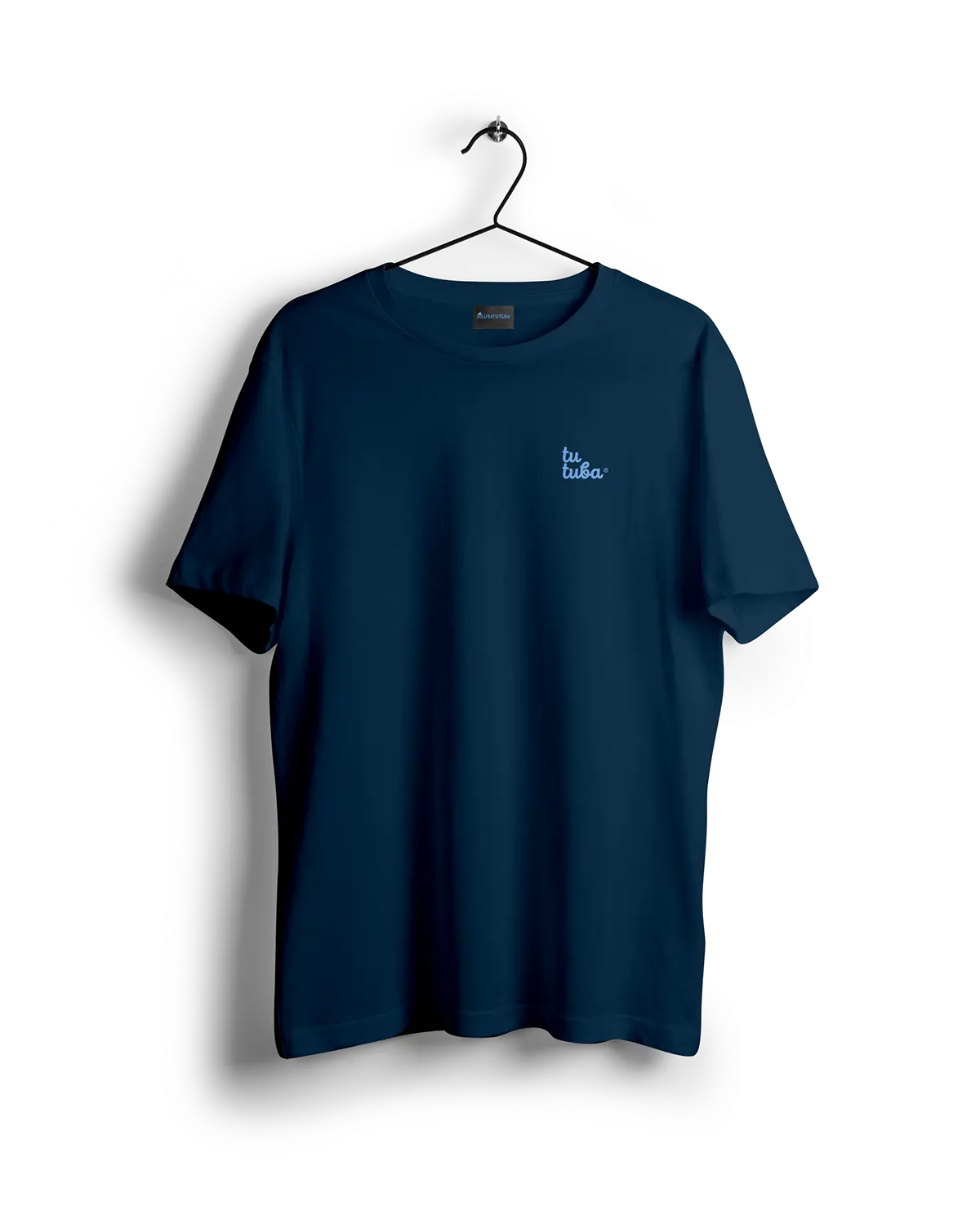
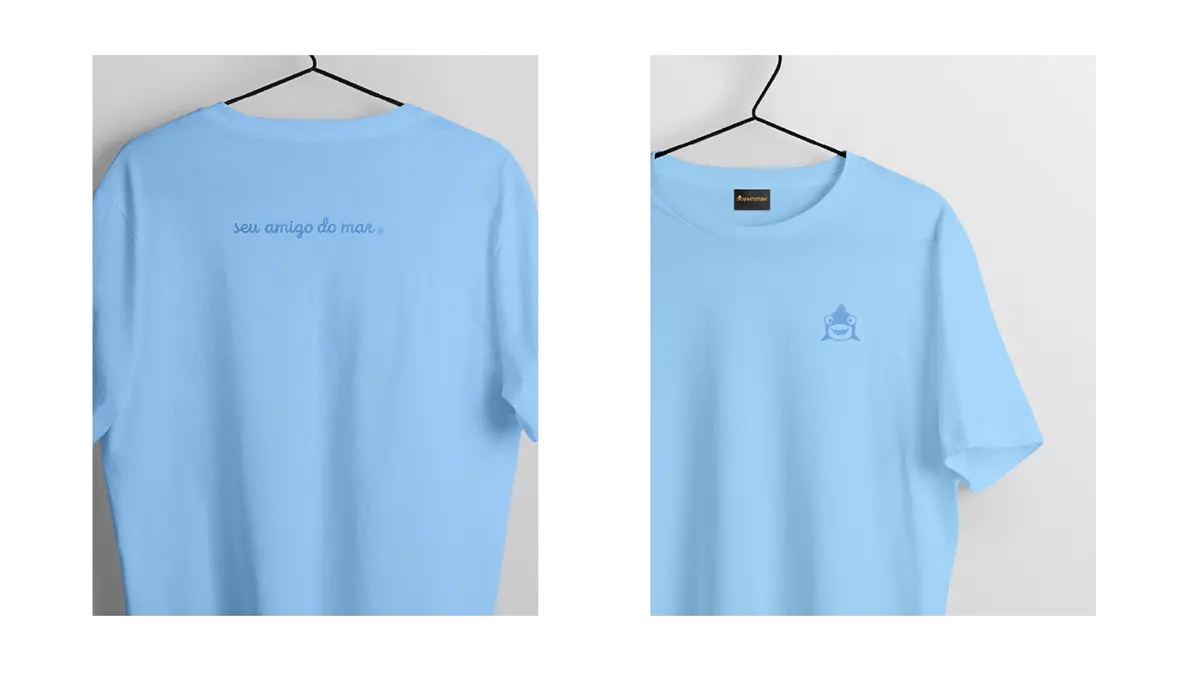
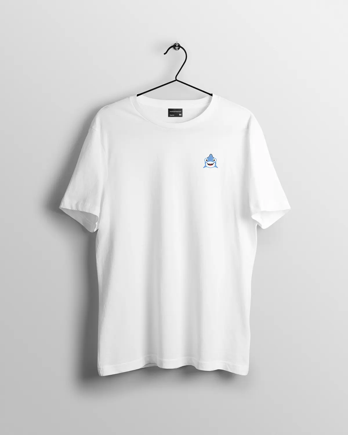
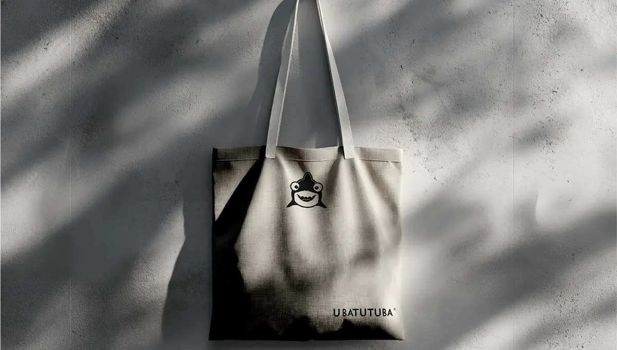
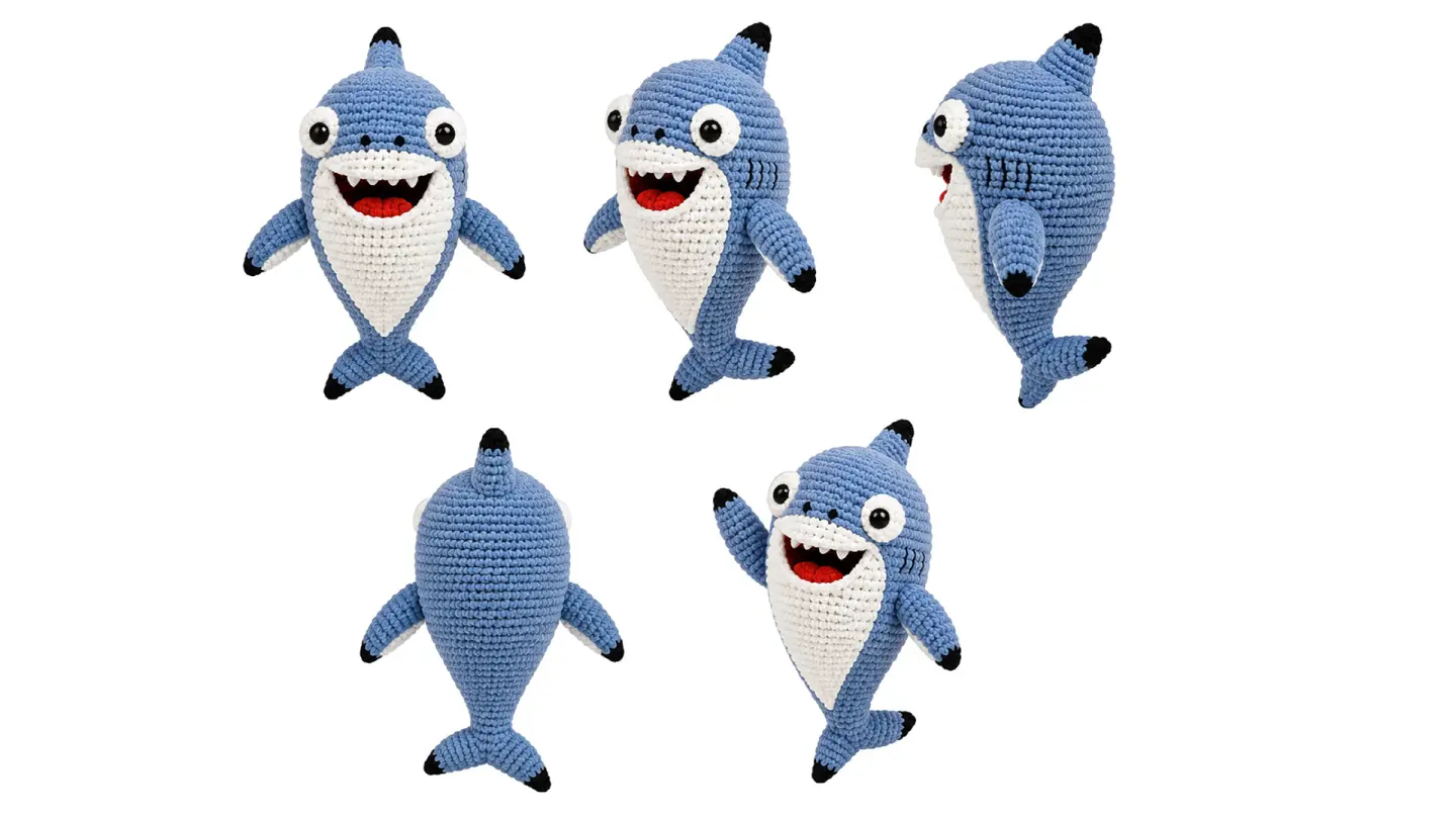
from concept to manufacturing — premium plush, 3D figure in recycled plastic, crochet mascot made by artisans from Ubatuba, terry cap, tote bag, shirts — through rounds of physical modeling, molding and material testing before any piece goes on sale. Digital & Store: made-to-order website and shop (ubatutuba.com.br), where each product is manufactured after the order — a model that validates real demand before scaling stock.
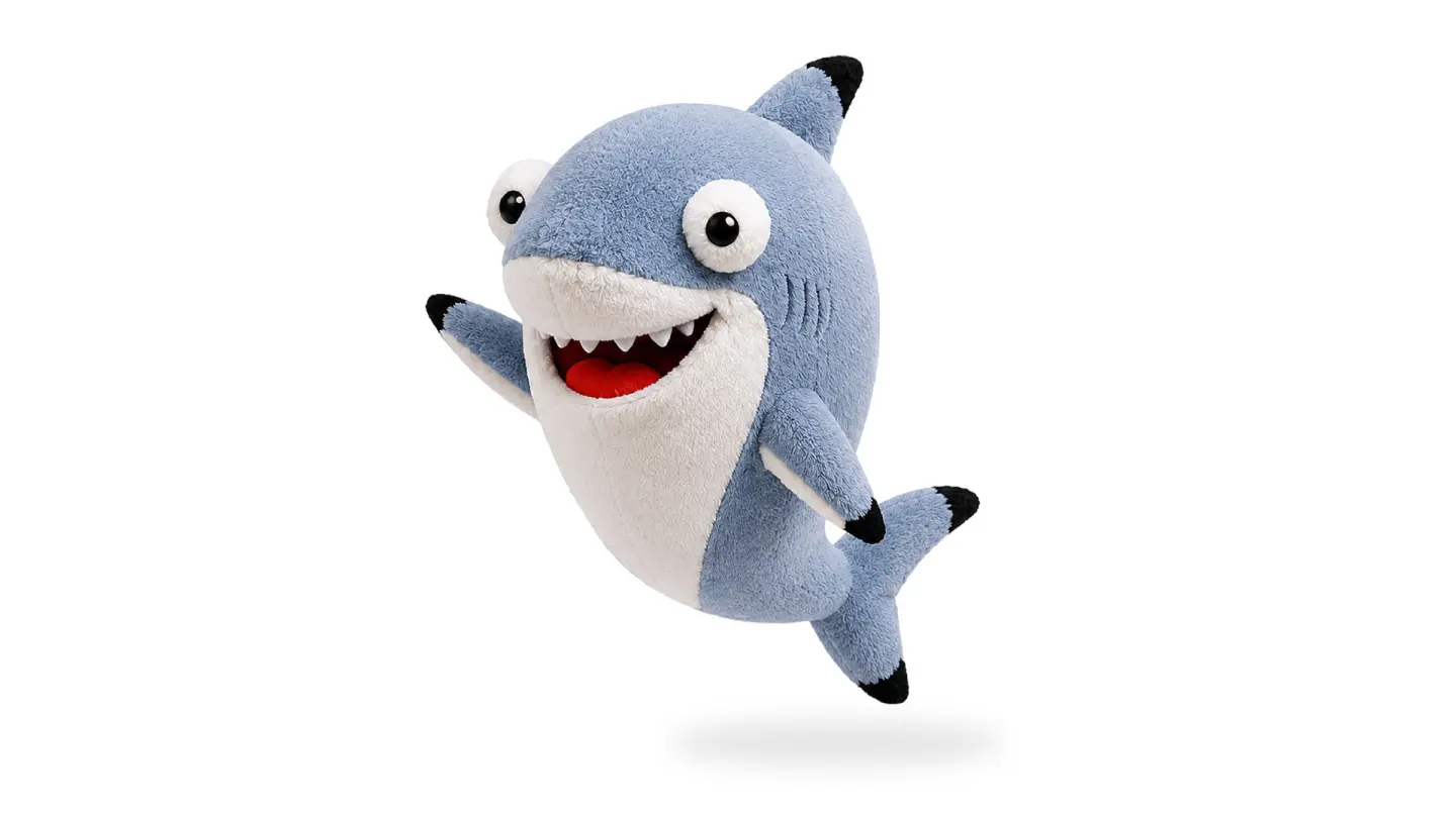

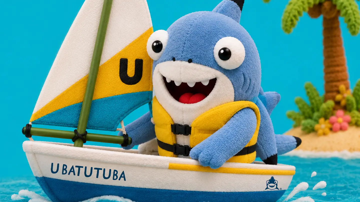
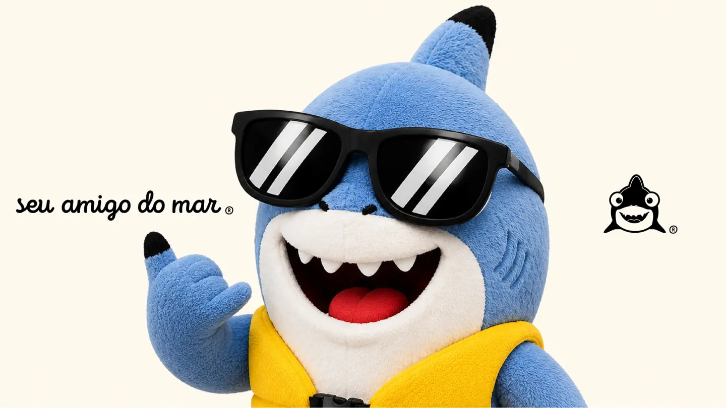
Web development
the UBATUTUBA website (ubatutuba.com.br) was built as the brand's digital showcase and, at the same time, as its operating engine: a made-to-order store, where each product is manufactured after the order, without the stock promise most mascot e-commerces take on. The experience was designed to carry the character's identity from first to last scroll — from the hero with the signature "seu amigo do mar" (your friend from the sea) to the product showcase, every section reinforces the same visual and verbal universe built into the brand. The purchase flow was simplified to WhatsApp and a direct form, prioritizing conversion and closeness over the complexity of a traditional checkout — a decision that reduces technical friction in the validation phase and keeps the team close to the customer on every order.


Growth & Fundraising
with product validated and operation running, the project moves to its first funding round — reaching the investor not with an idea on a slide, but with a working business: tested product, paying customer and a brand system ready to scale.
The result is a brand designed to be sold twice: first to the consumer, as a product that carries the identity of a place; then to the investor, as execution — proof that product design, brand, web technology and social presence already work together.