All work 01 Visual Identity
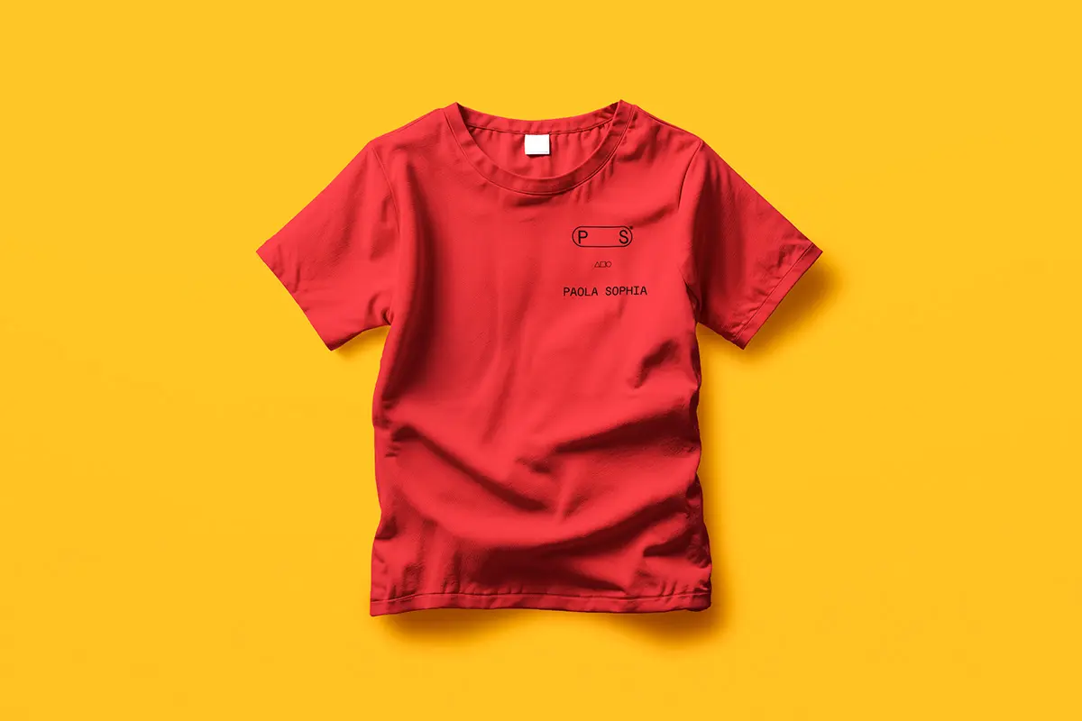
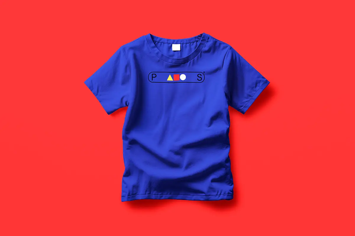
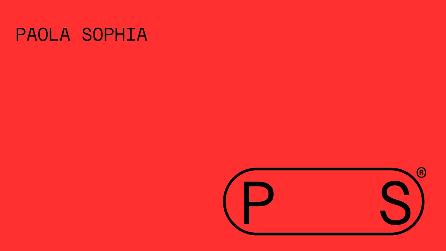
PS® - PAOLA SOPHIA
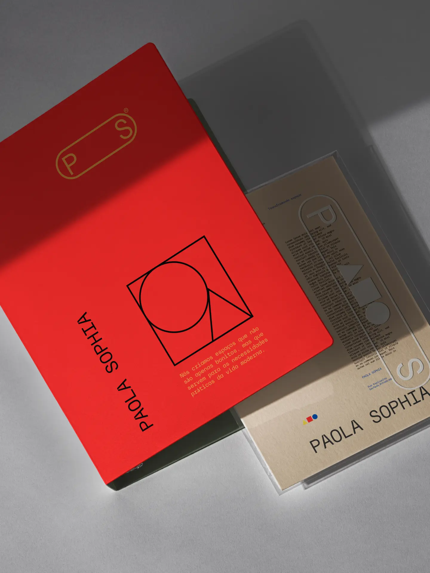
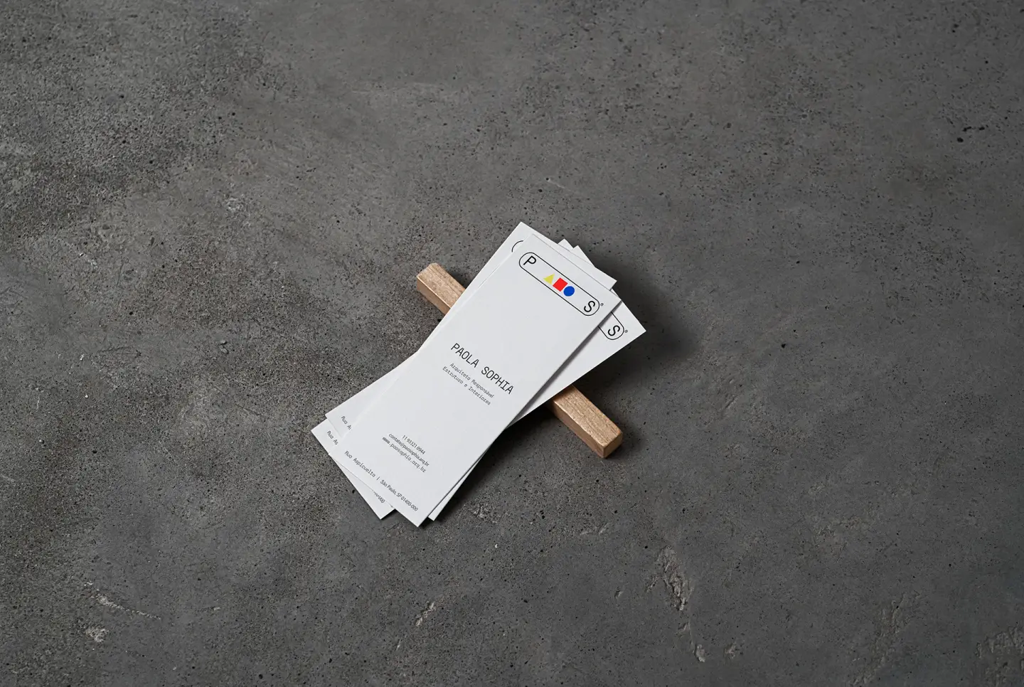
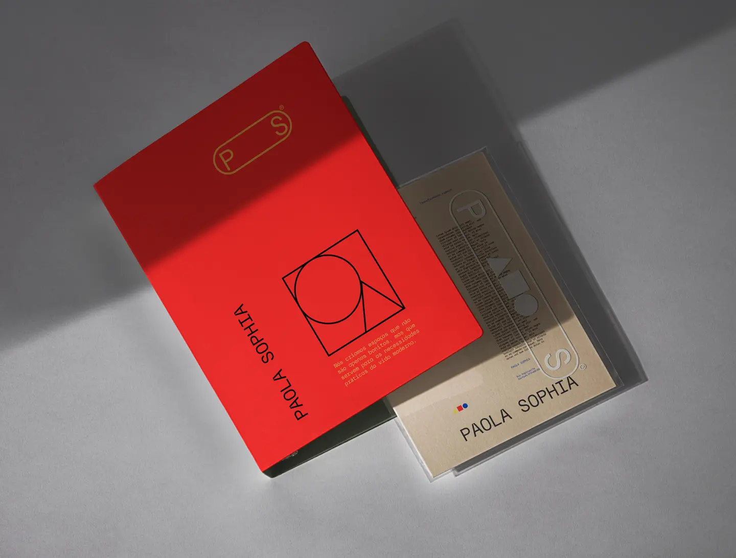
The branding project for Paola Sophia, a São Paulo architect known for creating innovative educational spaces, starts at the intersection of art, technique and function. A specialist in designing schools and learning environments in São Paulo, Paola brings to her practice the belief that the educational space is an active agent in the process of human formation.
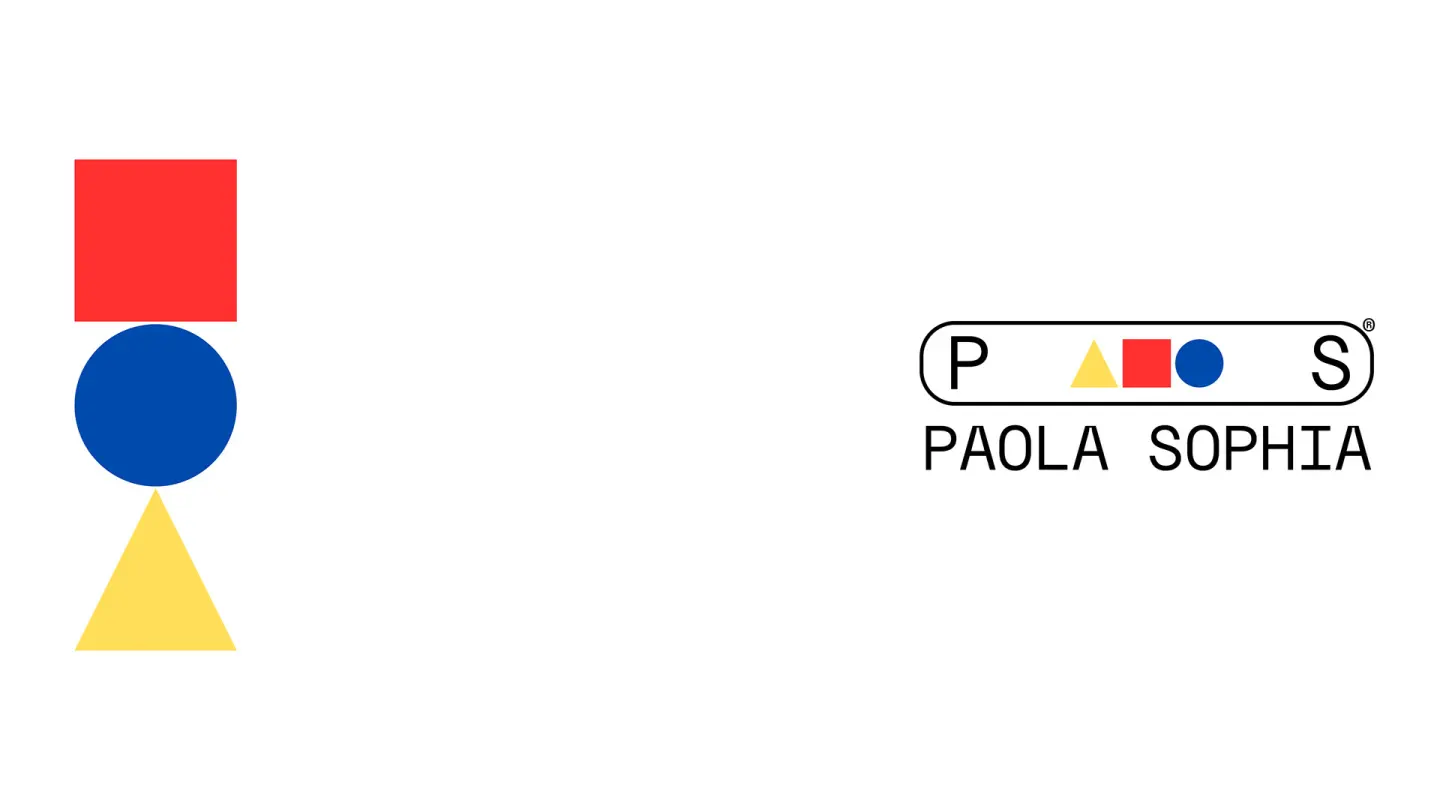
To translate that vision visually, we looked to the work of Wassily Kandinsky, the Russian artist and theorist who studied in depth the relationship between geometric shapes and colors, associating each element with an emotional and structural function. Kandinsky believed each basic shape — triangle, square and circle — had an essence of its own, and that its combination with specific colors produced clear emotional resonances.
In architecture, these shapes are fundamental too: used in plans and sketches to mark crucial points of structure, support, circulation or transition. What was once a technical instrument now becomes the brand's conceptual base: a visual language that translates the technical rigor of architecture into a living, expressive, contemporary aesthetic narrative.
Contemporary typography
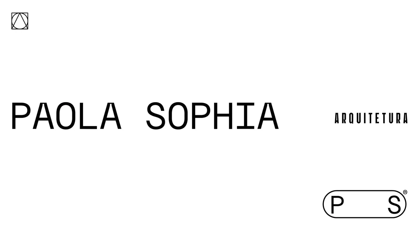
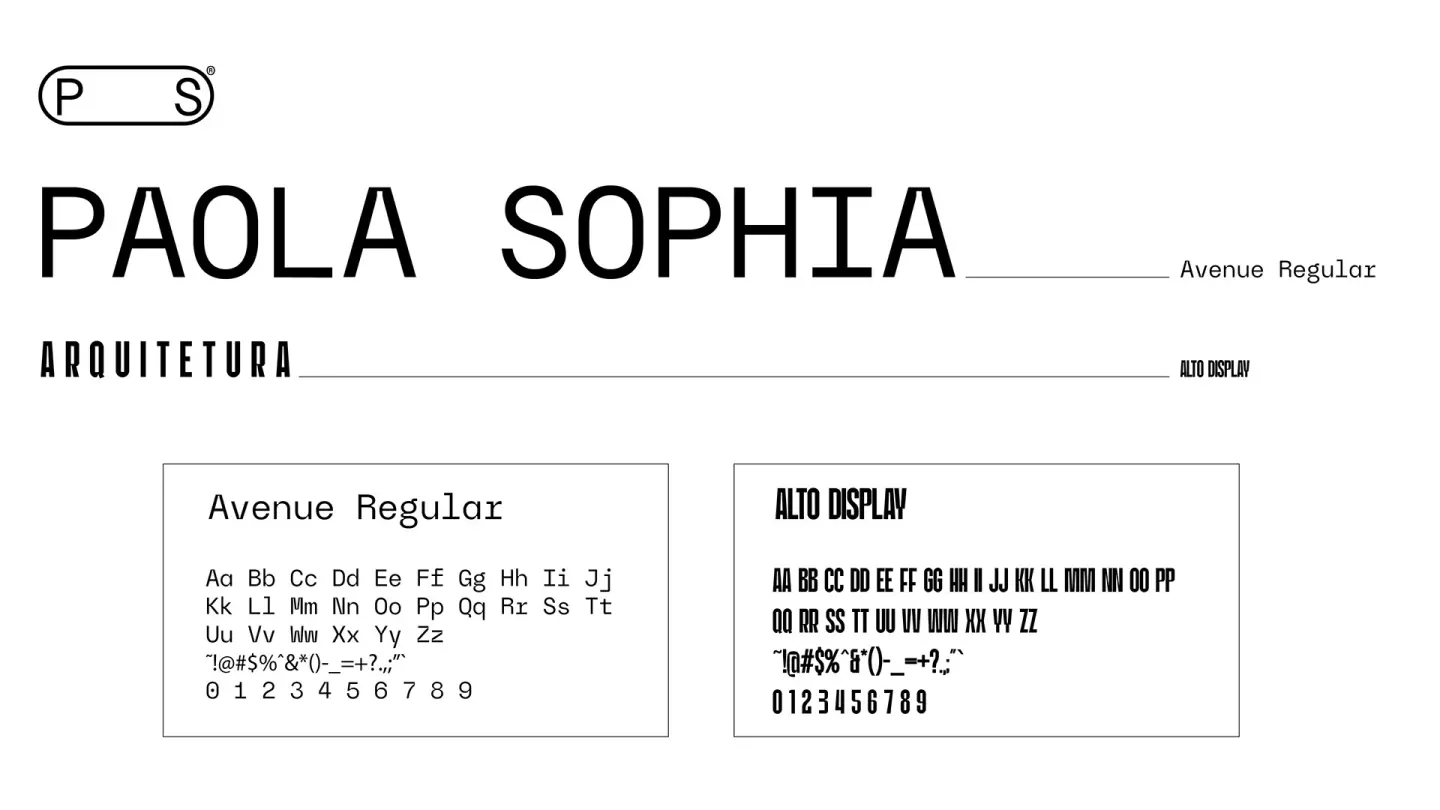
To complement this visual universe, two typefaces internationally recognized for their functional elegance and innovation were chosen:
Avenue Regular (primary typeface)
A geometric, minimal sans-serif, awarded by Awwwards as one of the best typefaces in digital design. Its clean, slightly rounded structure brings sophistication while communicating stability and professionalism. Ideal for representing the technical seriousness of Paola's projects.
Alto Display (secondary typeface)
Strong, with a marked personality and unique strokes, this typeface was chosen for highlight applications such as titles, visual signatures and promotional material. It works as an element of contrast and impact, complementing Avenue's sobriety with an intense, memorable graphic presence.
Shapes as Visual Language
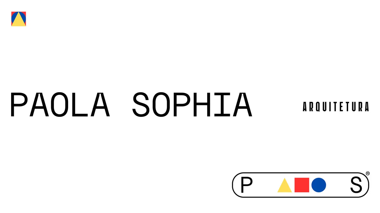
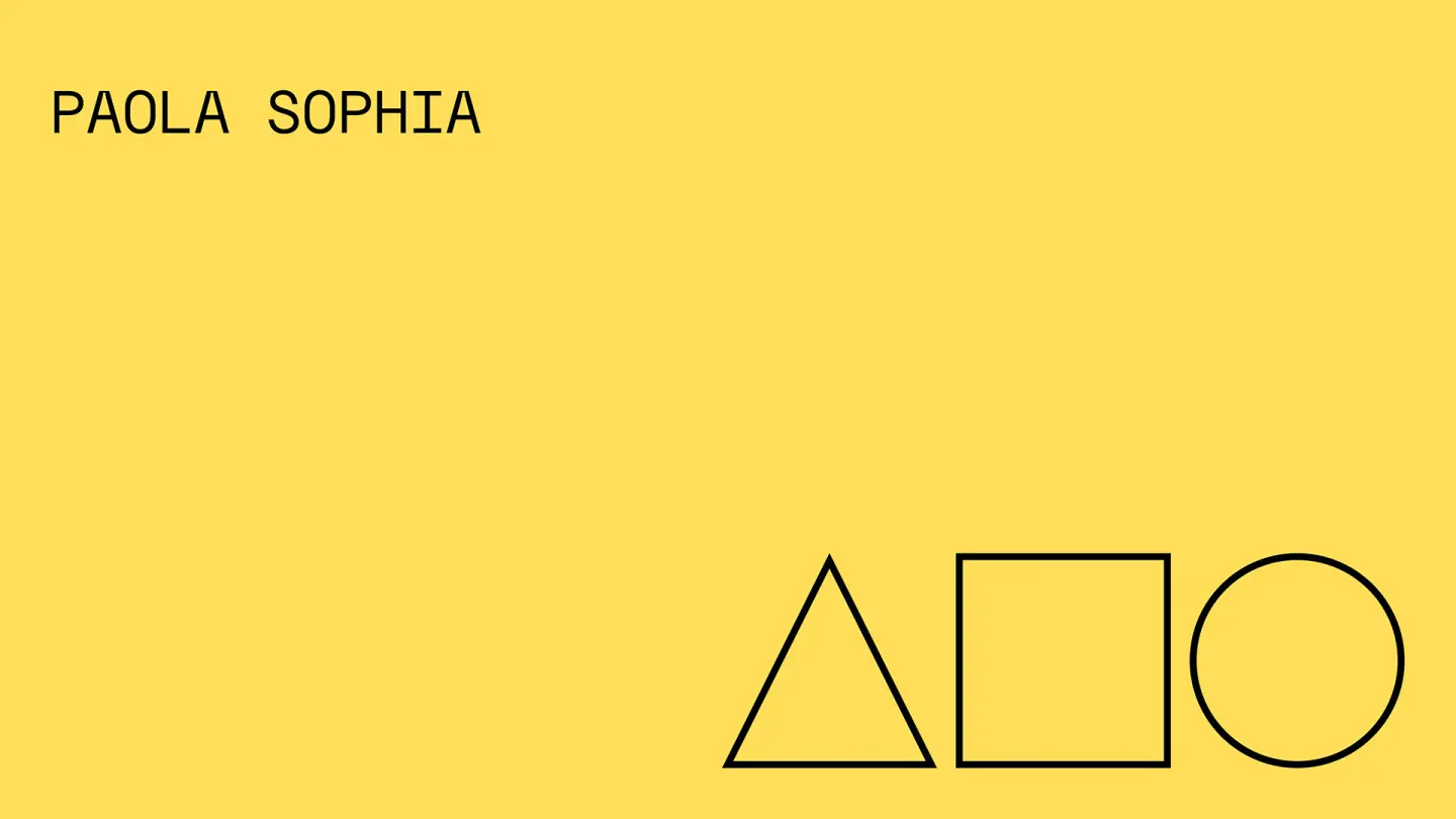
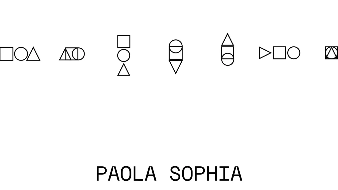
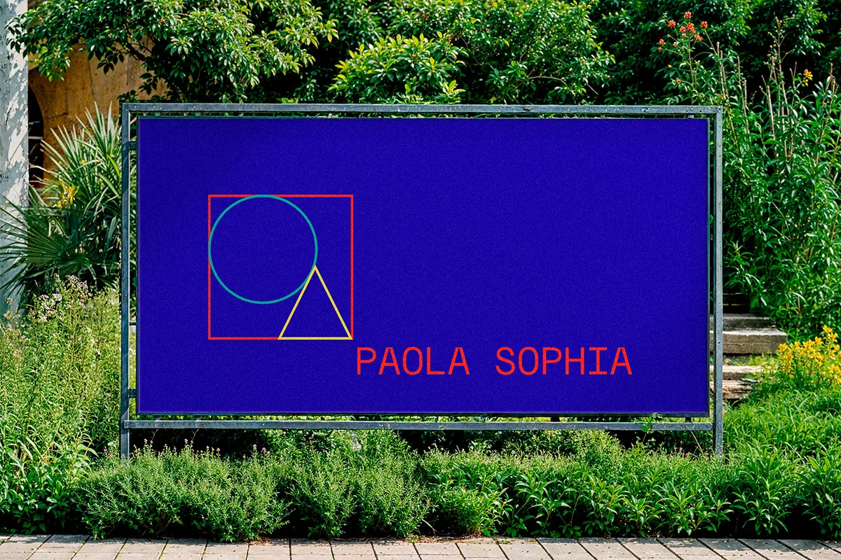
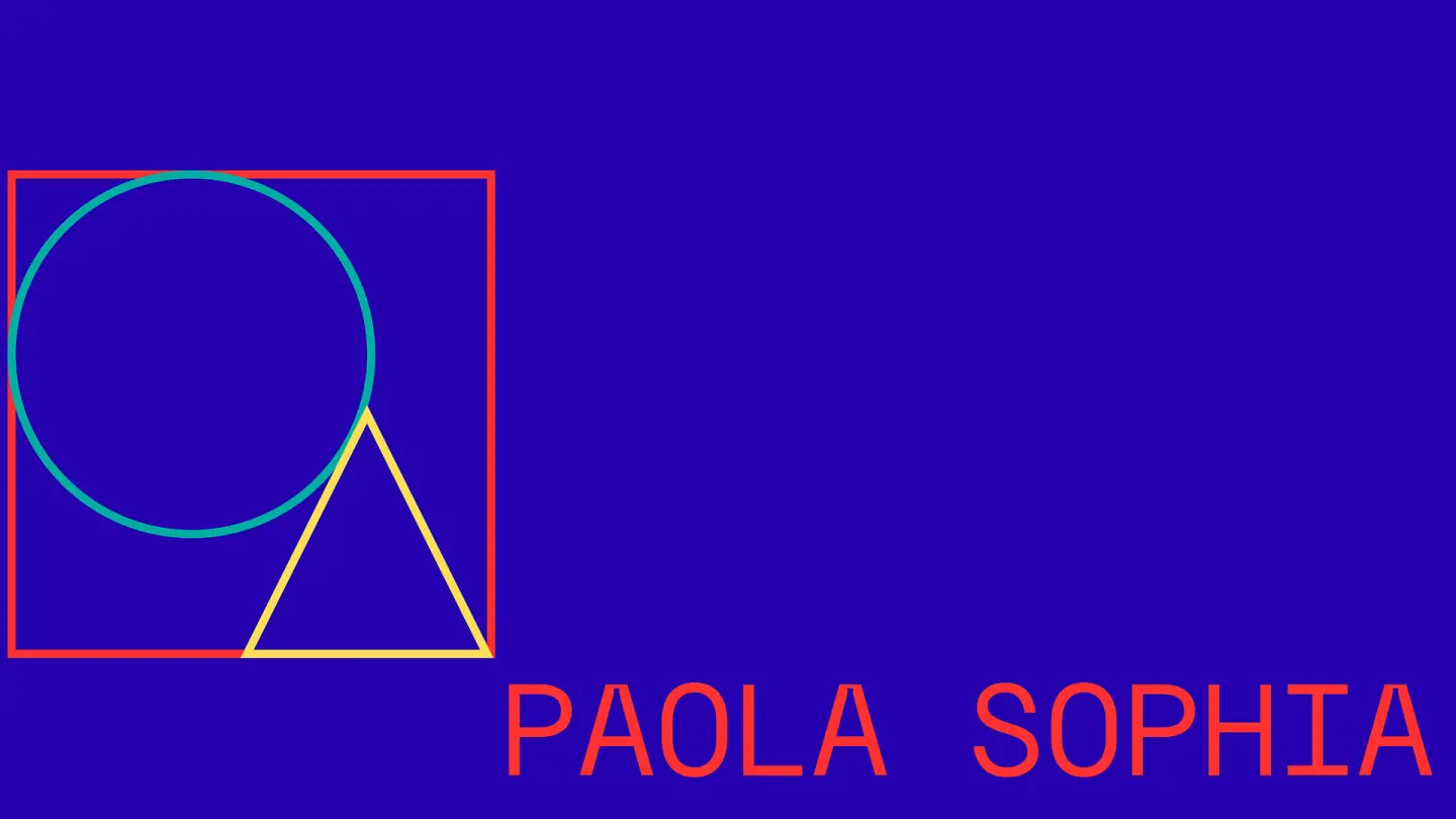
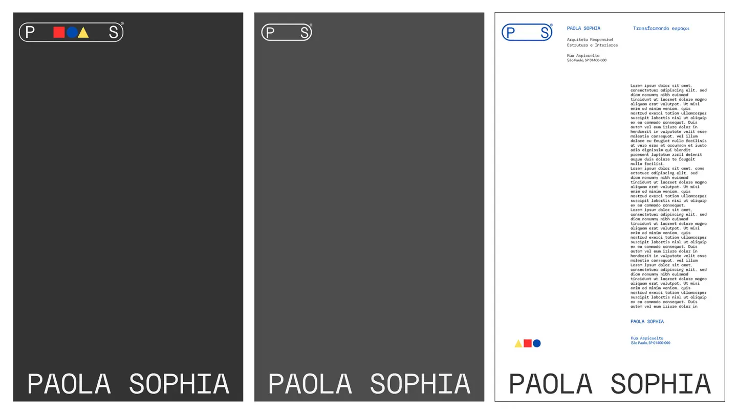
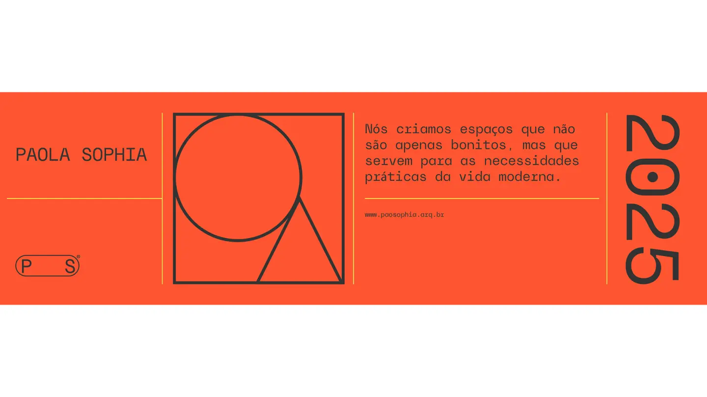
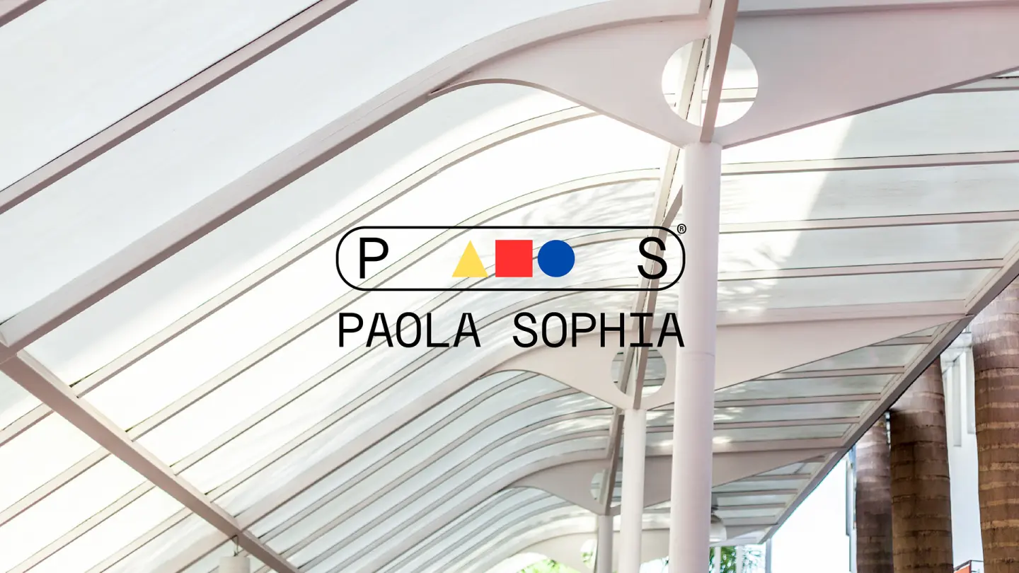
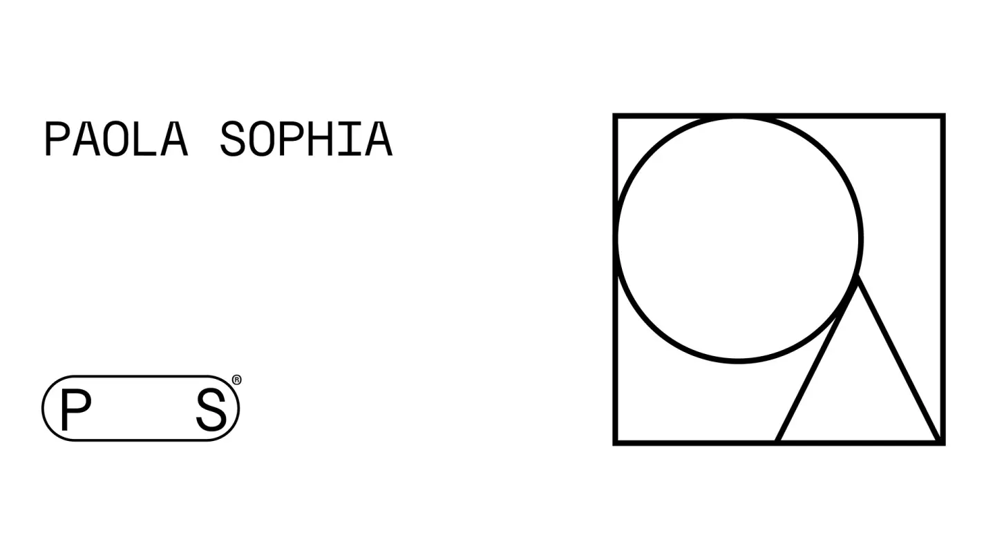
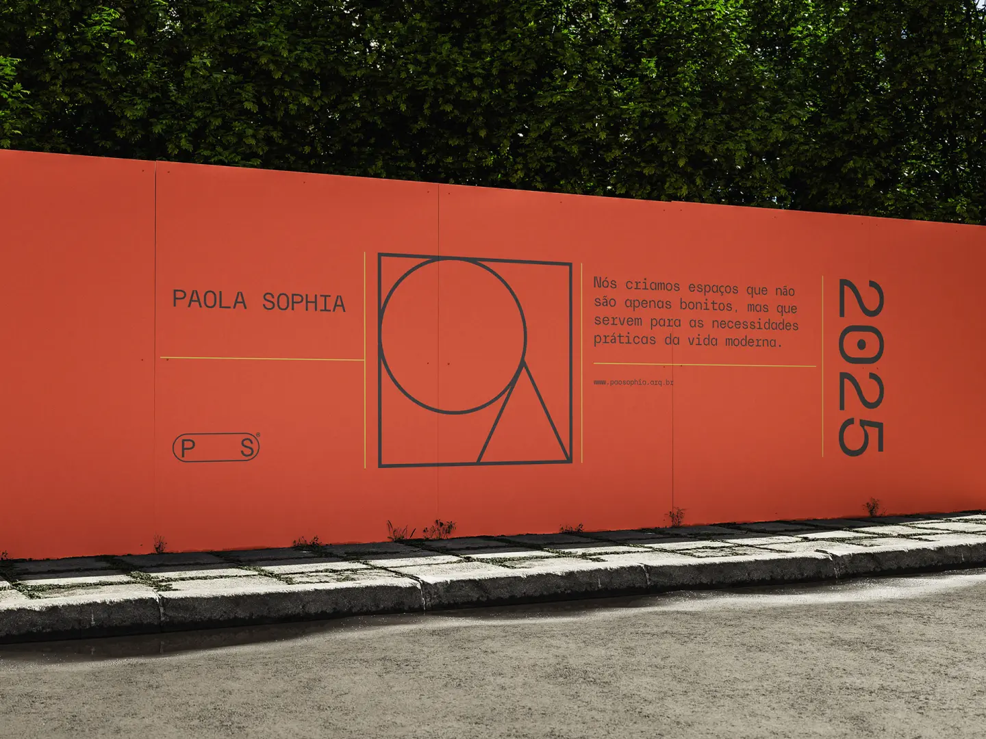
The basic shapes are used in the graphic identity both explicitly and subtly. They structure the layout, guide the eye and create a universal, intuitive visual vocabulary, reflecting the character of Paola's projects: spaces that welcome, guide and stimulate learning.
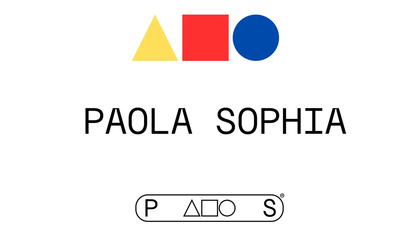
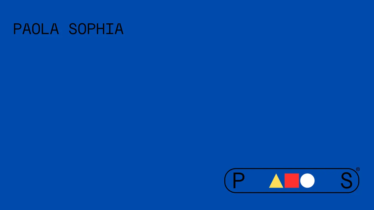
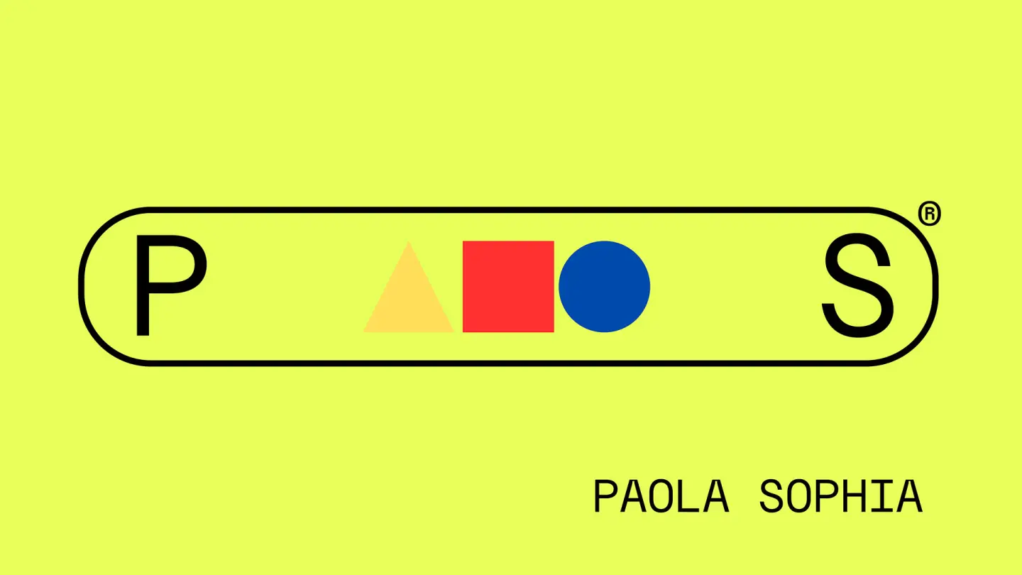
The triangle marks creative drive and directional thinking. The circle symbolizes the centrality of the human in the educational project. The square, in turn, represents the architect's solidity and technical reliability.
Colors and Kandinsky
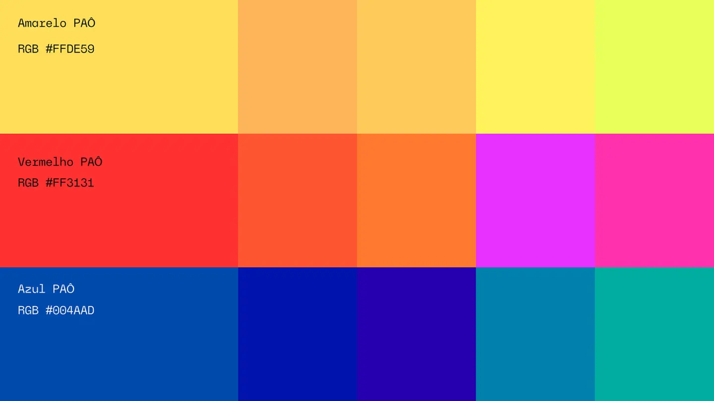
The project's colors were taken directly from the palette proposed by Kandinsky, where:
Yellow is associated with the triangle – a dynamic shape, in motion, that points directions and symbolizes energy and future.
Blue is tied to the circle – a harmonious, spiritual, enveloping shape.
Red relates to the square – a stable, strong, rational structure.
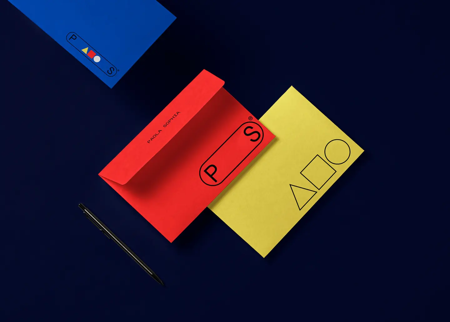
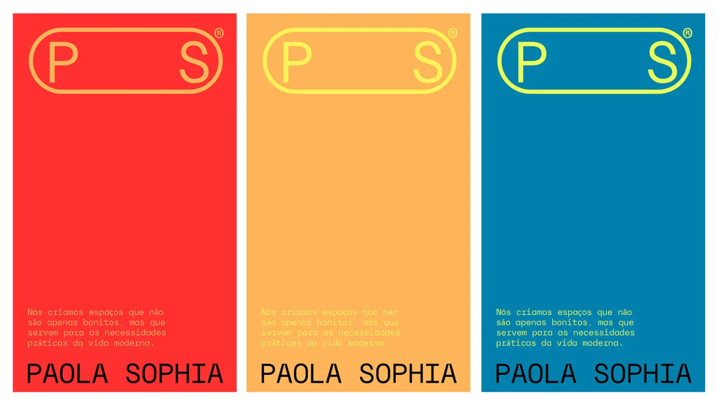
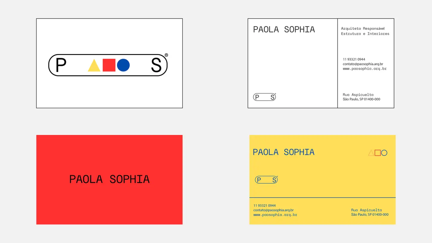
These colors were not used literally, but reinterpreted in vivid, bold, contemporary tones, reinforcing the vibrant, innovative and, at the same time, functional character of Paola Sophia's work.