All work 05 Software & AI
Trovão Tropical - 3D animation, design, coding, web
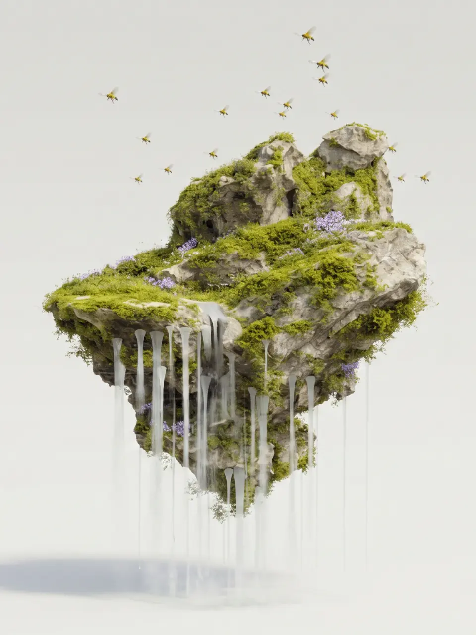
Agroecology, art and territory. Three fronts Trovão Tropical carries at once — a newspaper, native seeds, bees, a garden in the favela, active body, biophilic design, a seed collective — and that the Home page needed to present without becoming a menu disguised as a corporate site. The challenge was not to illustrate a concept, but to give territory to a brand that is multidisciplinary from birth.
Scene, image, animation, code
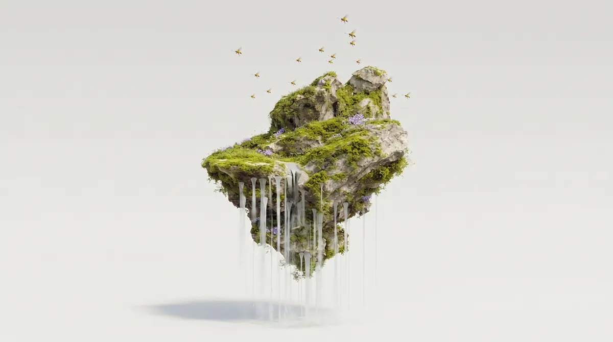
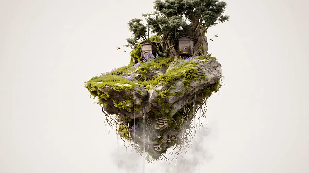
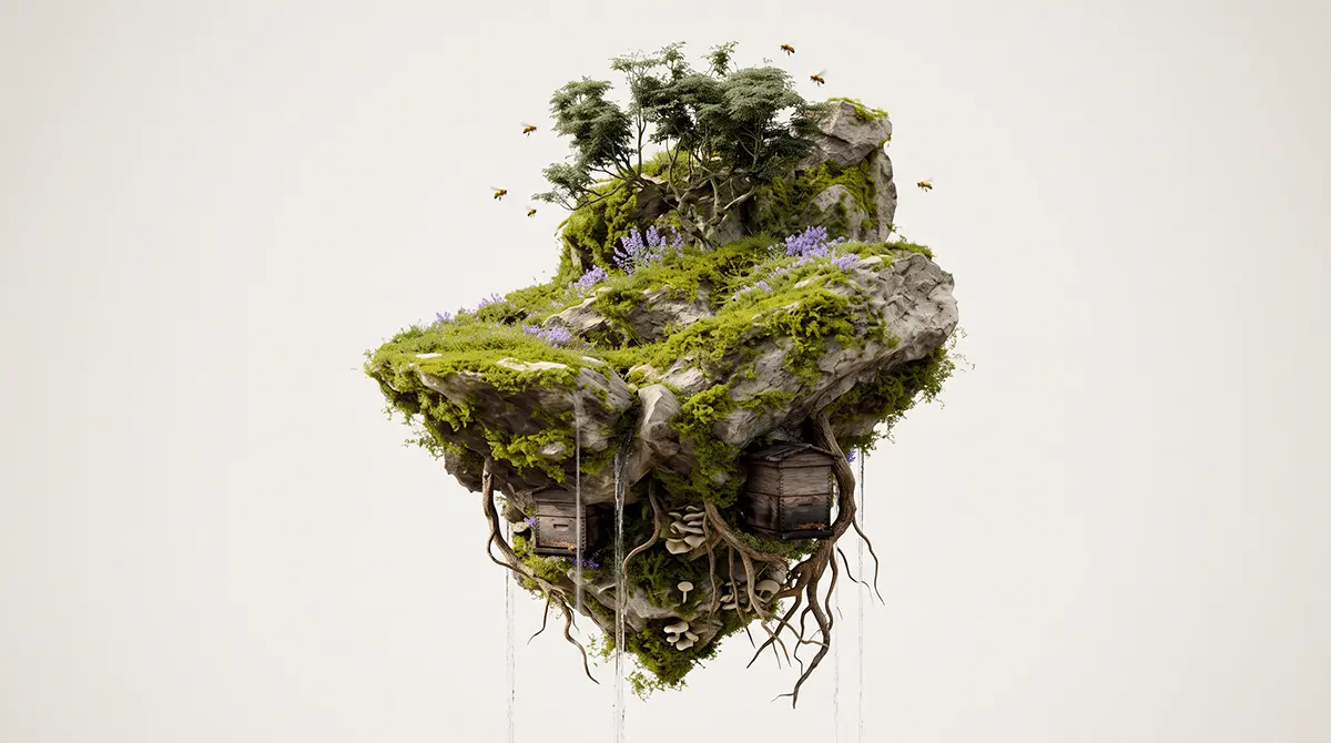
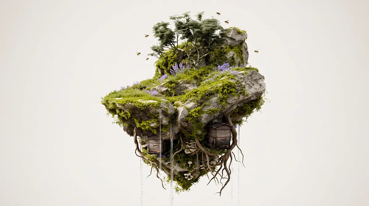
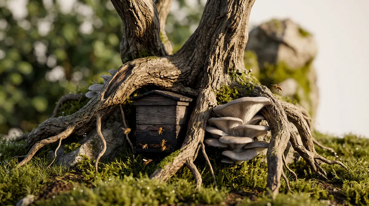
The answer was to build surreal scenes: an island suspended in the void, roots dripping into nothing, forest capsules, a house in the canopy. A floating territory that works as metaphor — each front of the brand (agroecology, native seeds, active body, art, community) gets an anchor point inside that same scene, instead of an isolated section.
The process ran in three layers. First, image: dozens of compositions produced until the framing, light and atmosphere matched the ideal scene. Then, animation: the static scene gained depth and movement of its own. Only then, code — turning the animated piece into an object that reacts to scroll and hover, not a decorative illustration at the top of the page.
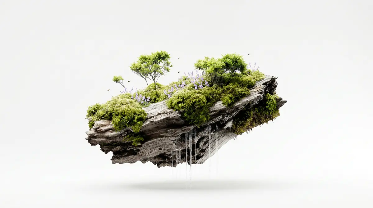
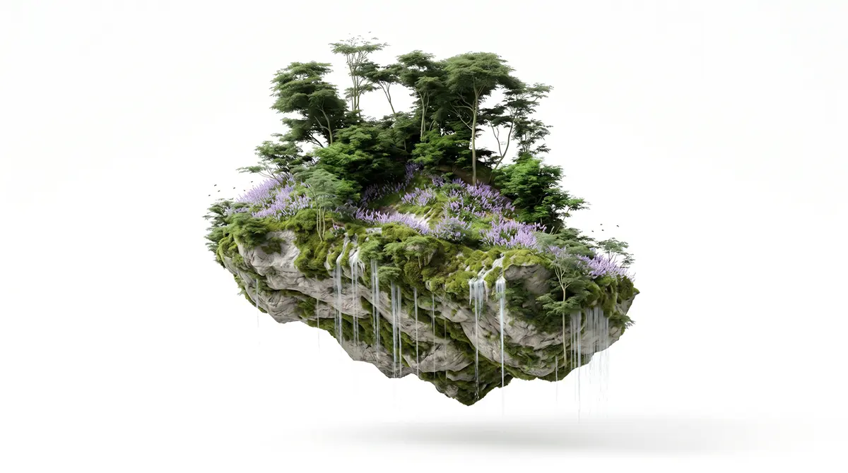
Motion research — v1 to v8
The interactions (hover, parallax, menu transitions, the behavior of the island itself) went through eight full versions before closing. Each version tested a different reference, and it was this accumulation — not a single decision — that produced the final aesthetic: experimental, raw, deliberately outside the corporate standard. The site took on a post-punk tone: heavy type, visual friction, broken grid.
Result
The Home stopped being a generic front door and became navigable territory: a single scene that carries agroecology, art and community inside it, with a visual language that owns noise as part of the identity — not as a production accident.
Noise became DNA
while reviewing the side cutouts that open each section — the "TVzinha", the little TV — a technical problem showed up: the images lost definition and pixelated. Instead of treating it as an error to hide, the way out was to embrace it: anchor the brand's visual DNA in that very cutout, pulling toward a punk collage aesthetic — a direct reference to Barbara Kruger.
The image residue became an art direction choice, not a technical limitation in disguise. That same language research drew on references outside the agro/institutional universe, which helped calibrate how far the experimental aesthetic could go without losing legibility.