All work 01 Visual Identity
Paraíso Verde - (RE)BRANDing
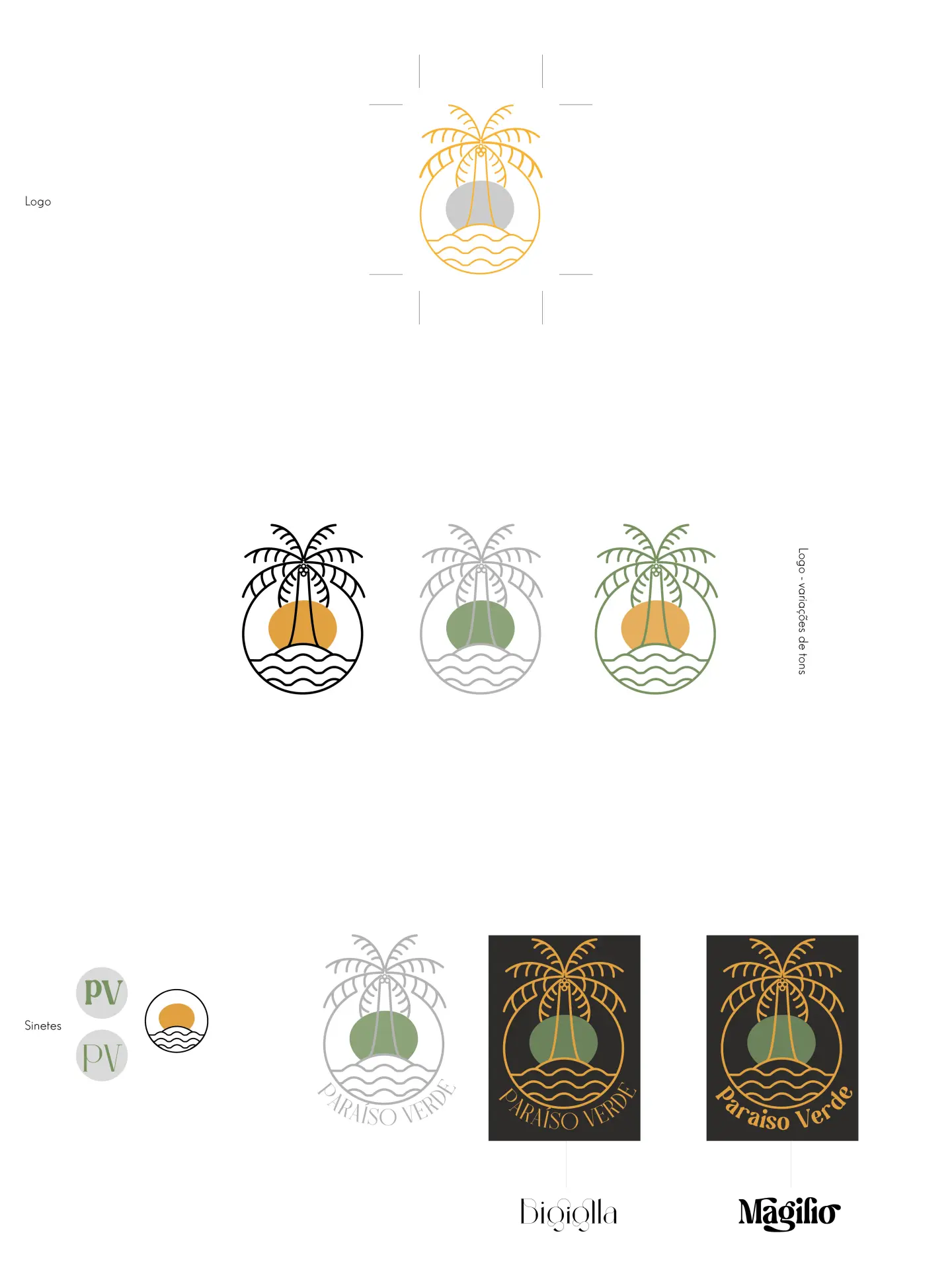
Rebrand for Paraíso Verde, extra-virgin coconut oil from Bahia. The old logo was a low-res, non-vector art deco label with an accent typo; the new one keeps the idea of tradition and swaps ornament for a line pictogram: coconut tree, sun and waves inside a circle. Light serif type (Bigiolla and Magilio), olive green, mustard and black palette, with an art deco framed label as a companion piece.
The brief in one line: classic without being stiff. The sun becomes a standalone seal and the PV initials a stamp. The horizontal label carries a geometric frame, sun rays and "since 2010", in black and green versions.
