All work 01 Visual Identity
ORAYÊ
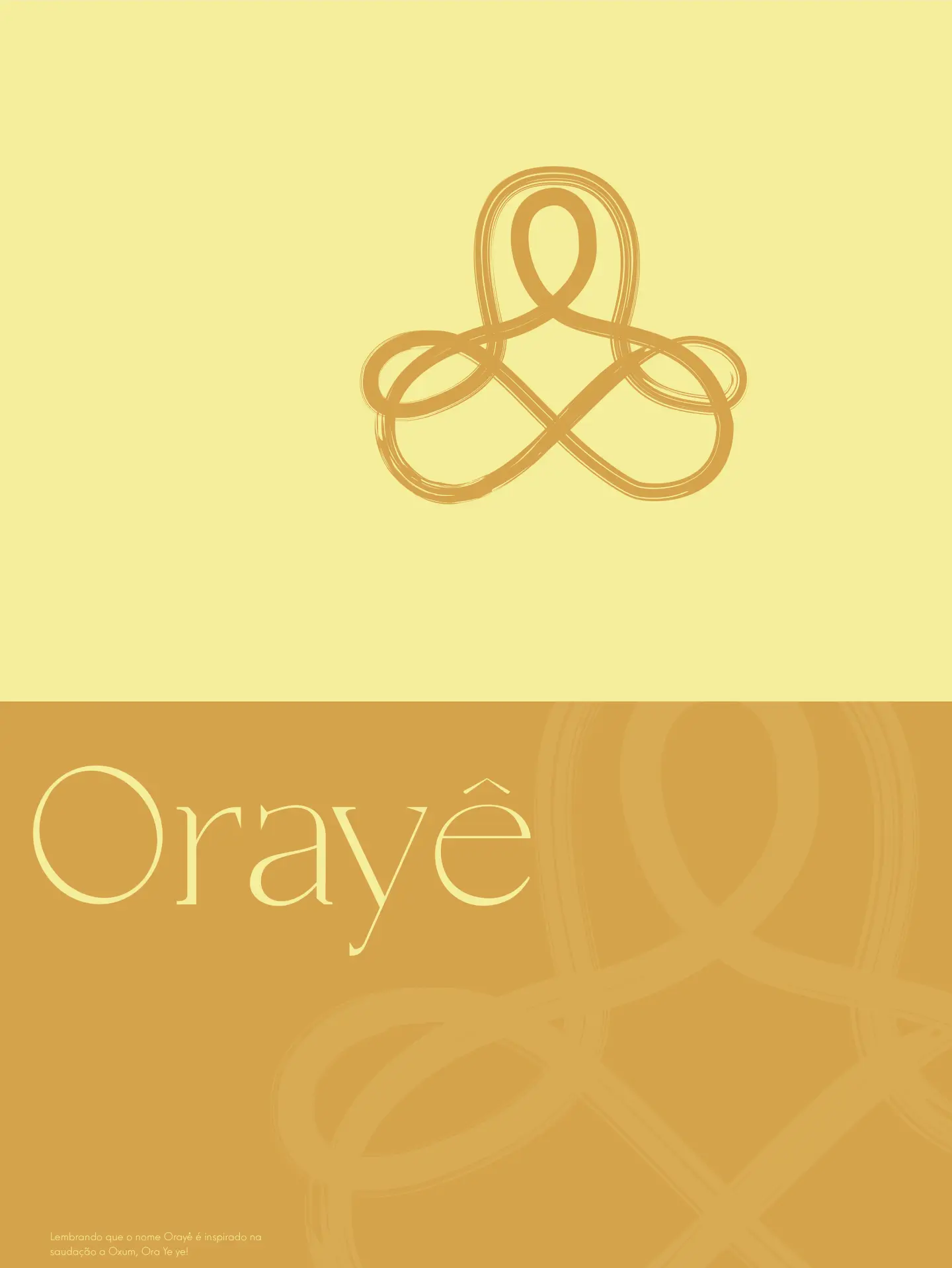
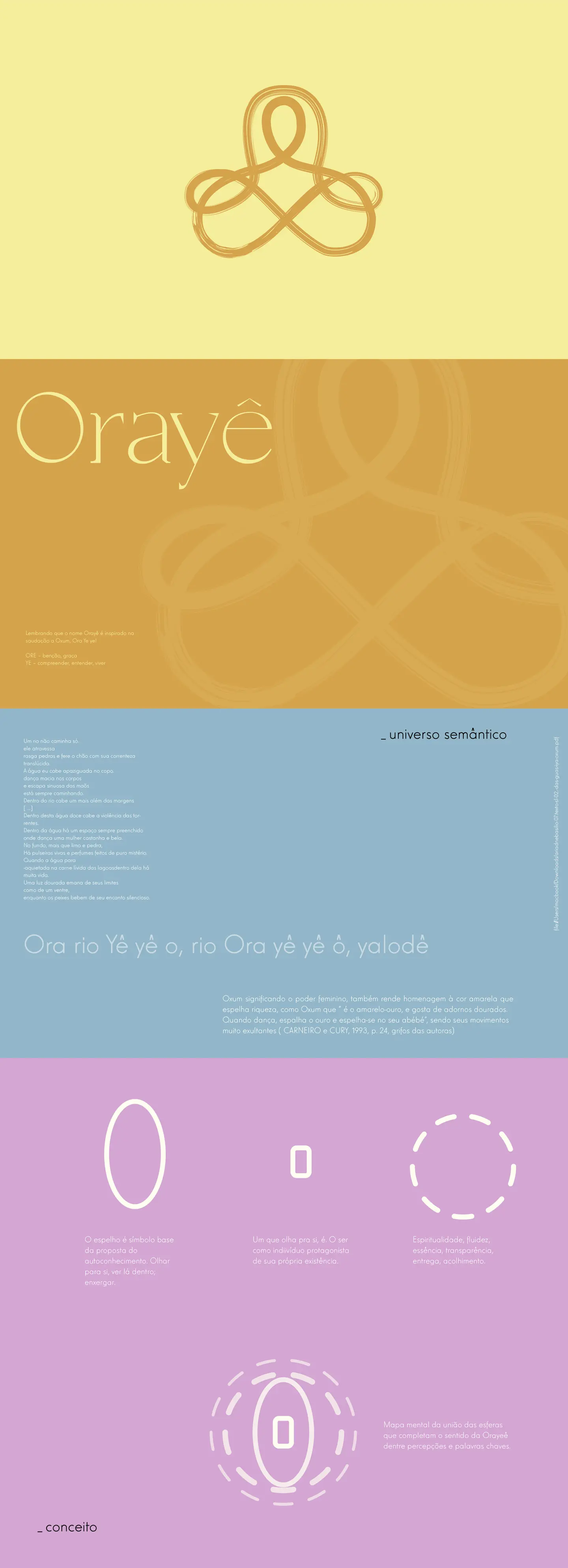
Identity for Orayê, a therapy and self-knowledge space. The name comes from the greeting to Oxum, and the symbol is a continuous three-loop knot drawn with a brush, hinting at water and a mirror. Thin serif wordmark (Casta Thin) and a palette of golden yellow, lilac and mint, with gold leaf as the texture reference.
The concept starts from three shapes: the ellipse (a mirror, looking inward), the small rectangle (the individual) and the dashed circle (spirituality, flow); merged, they produce the knot. The symbol shows up as a brush stroke, as a clean line, and inside round seals with inverted colour pairings.