All work 01 Visual Identity
_MARANTA
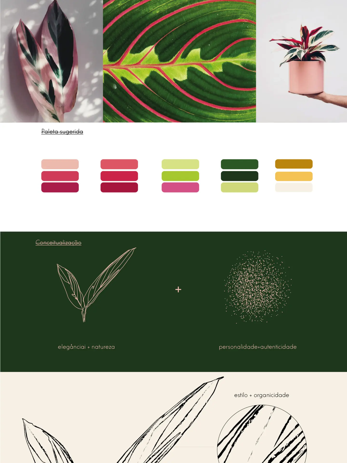
Brand for Maranta, a womenswear store built around conscious consumption. The name comes from the Marantaceae plant family; the symbol is a pair of leaves in a thin line drawing, and the wordmark is a classic uppercase serif stacked as _MA / RAN / TA. Palette of deep green, pink and wine, gold and off-white, applied on kraft tags, a black shopping bag and cards.
The leaves appear as a thin line, as a dry brush stroke and as an enlarged crop, always as background graphics. The underscore before the name is part of the mark. Two-sided cards: gold leaf on green, name on off-white.

