All work 01 Visual Identity
DotConect
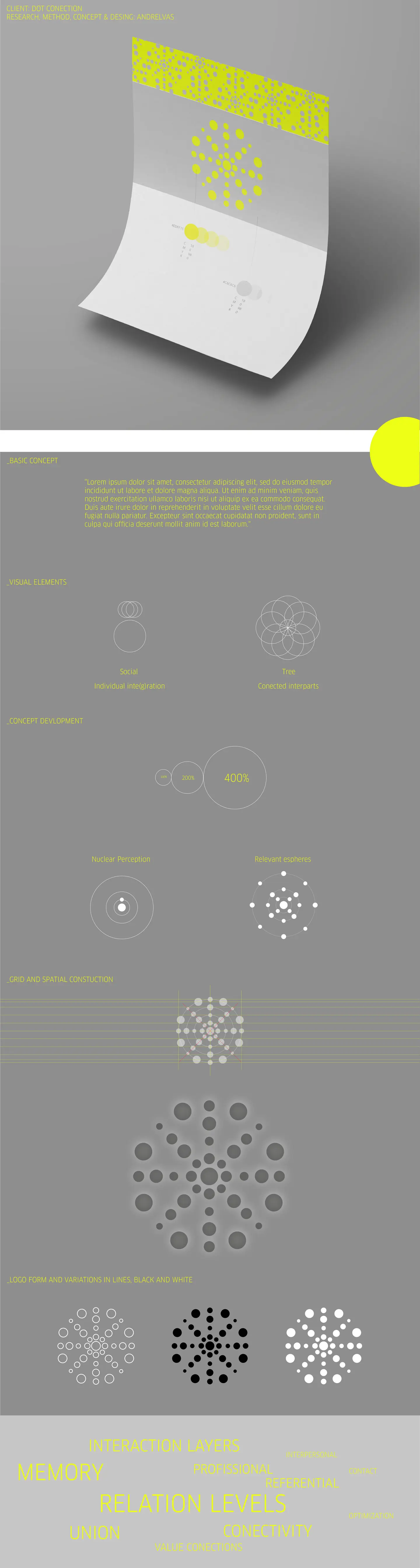
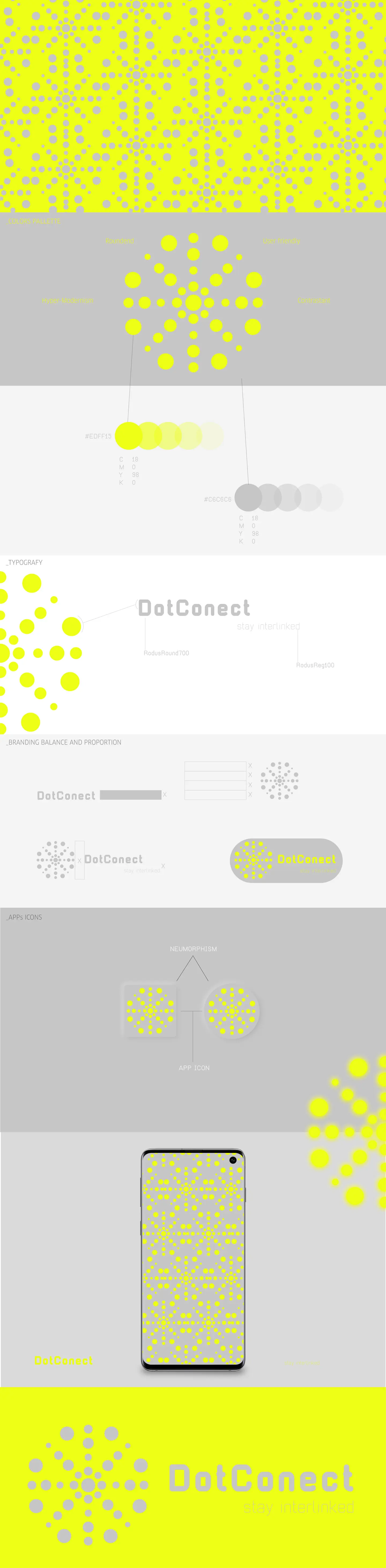
Identity for DotConect, a people-connection platform ("stay interlinked"). The symbol is a constellation of dots in concentric rings growing outward from a centre, standing for a nucleus and its spheres of relation. Medium-weight rounded sans wordmark, fluorescent lime yellow over greys, with a neumorphic app icon and a dot pattern for phone screens.
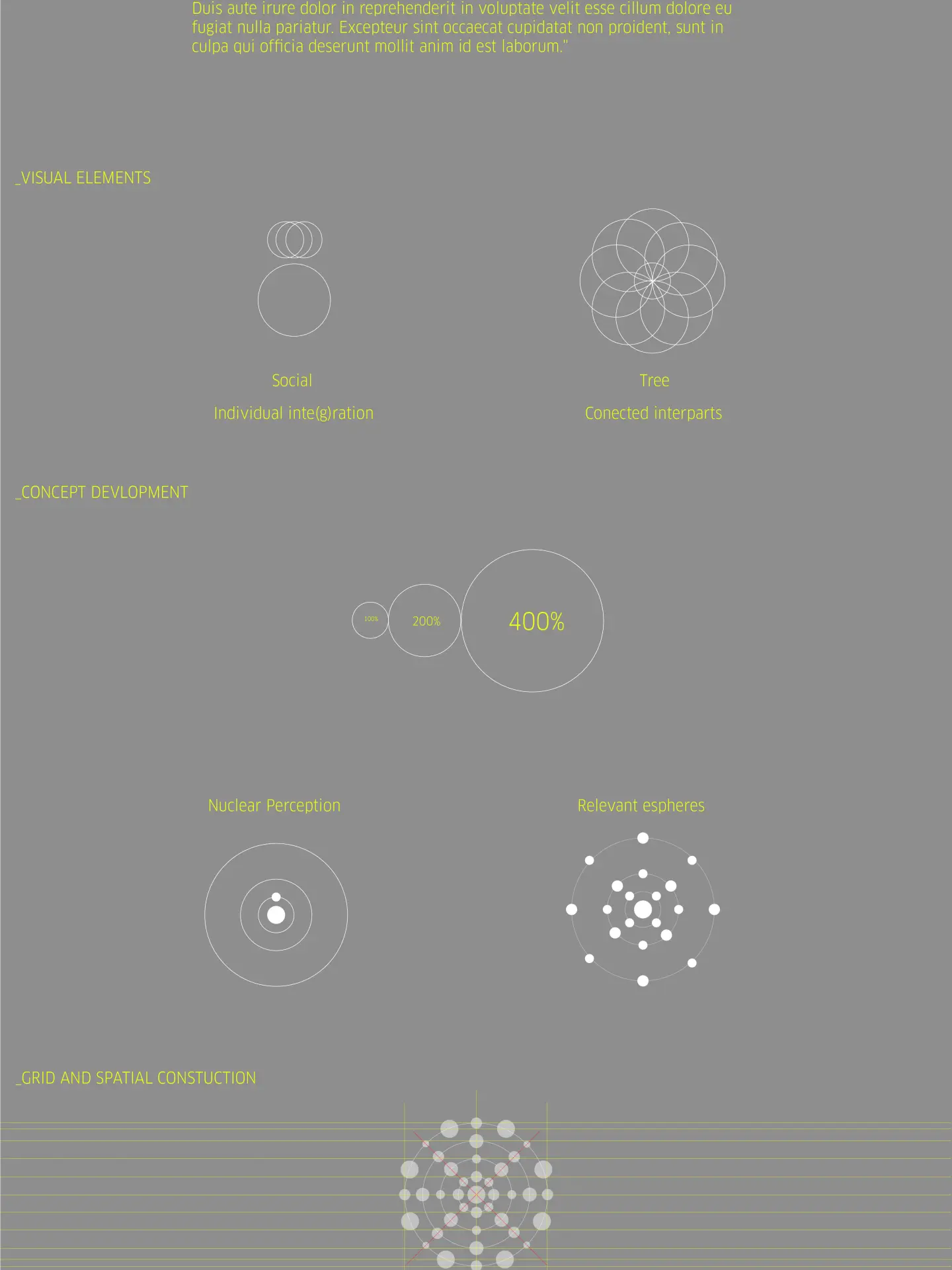
The concept starts from two visual elements, "social" (individual integration) and "tree" (connected parts), plus diagrams of nuclear perception and relevant spheres. The symbol follows a radial grid and repeats as a pattern on bands and app backgrounds.