All work 01 Visual Identity
DIVINESSÊNCIA

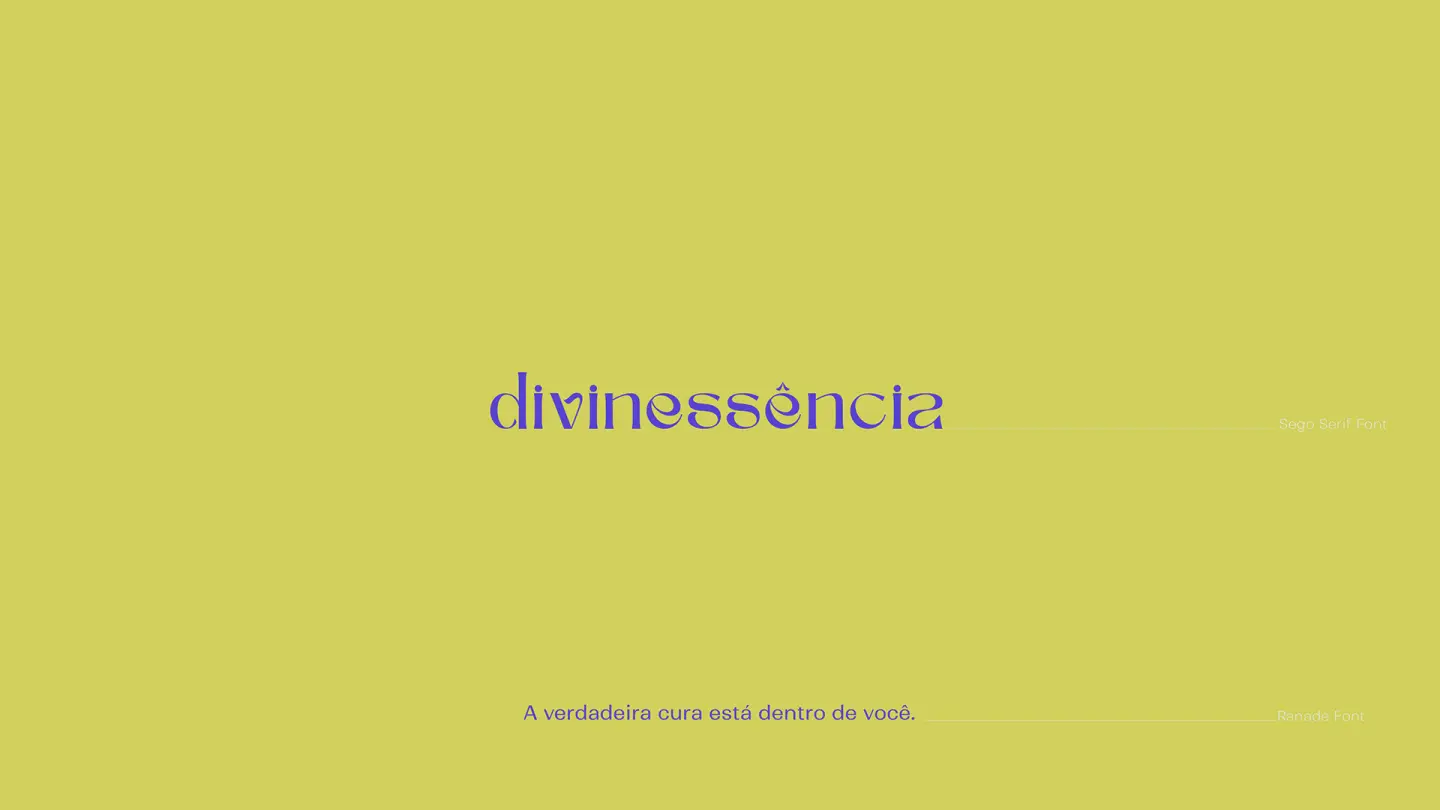
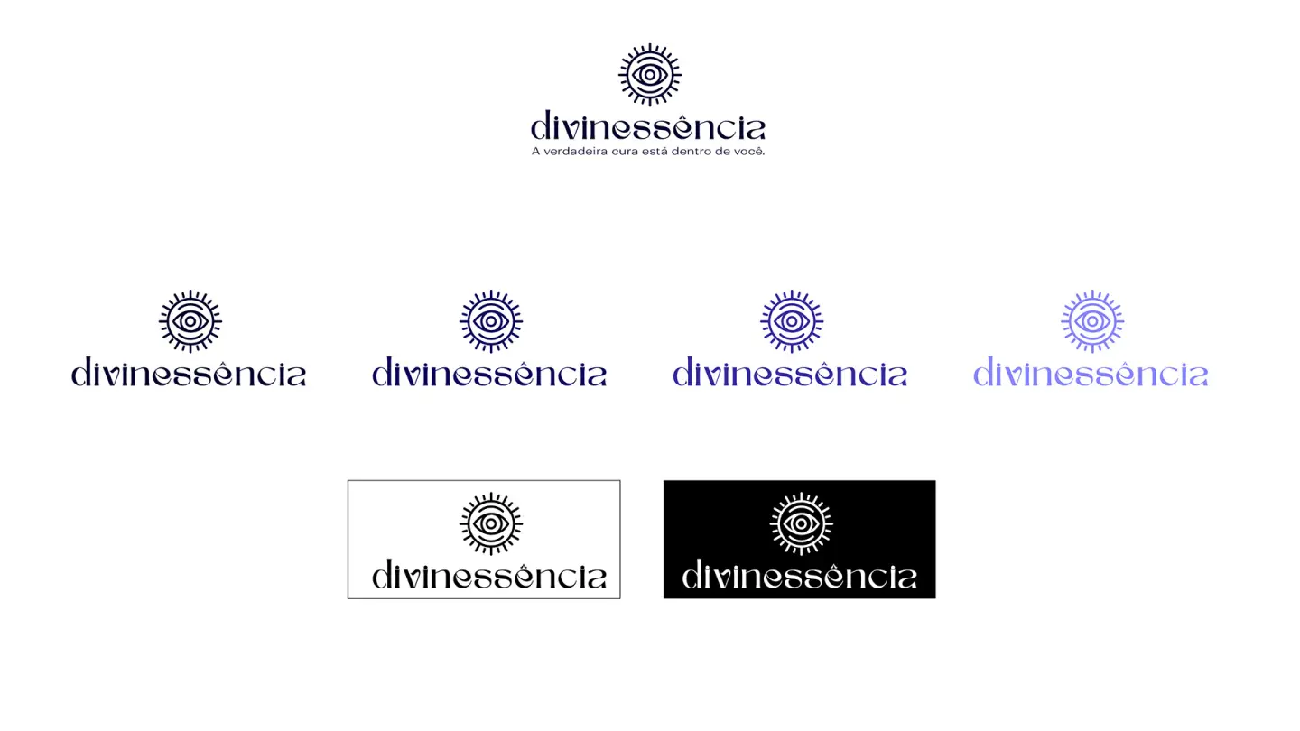
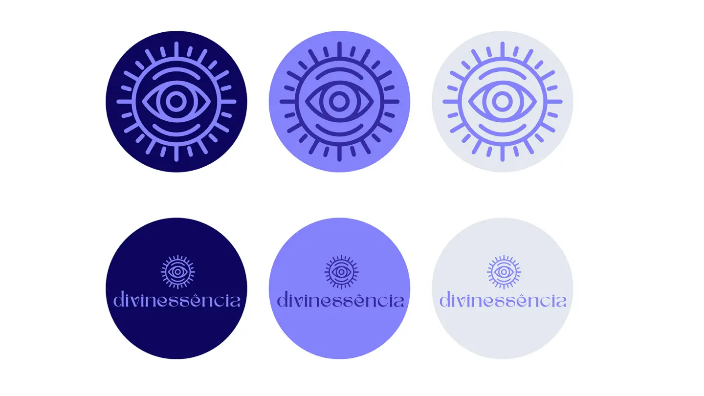
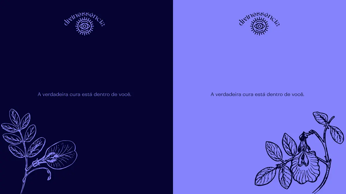
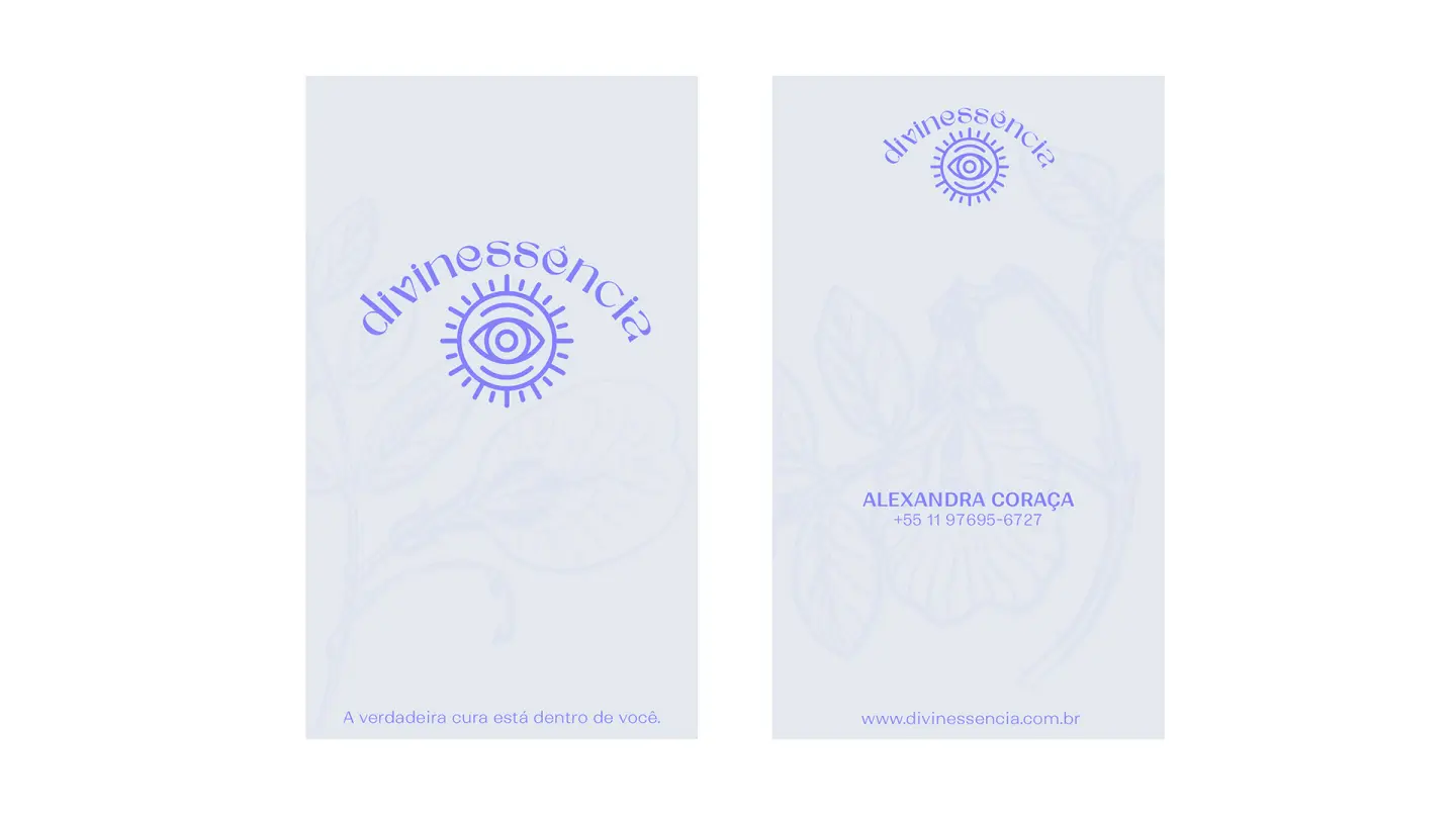
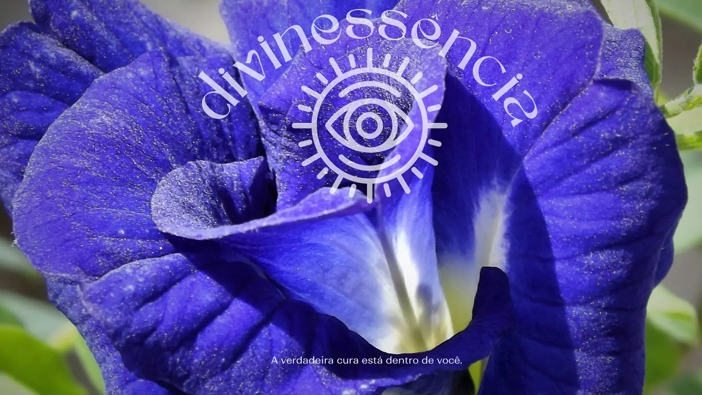
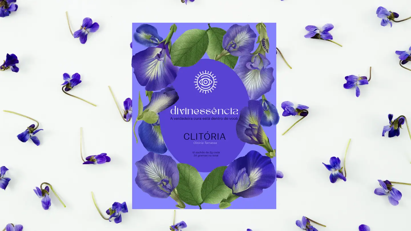
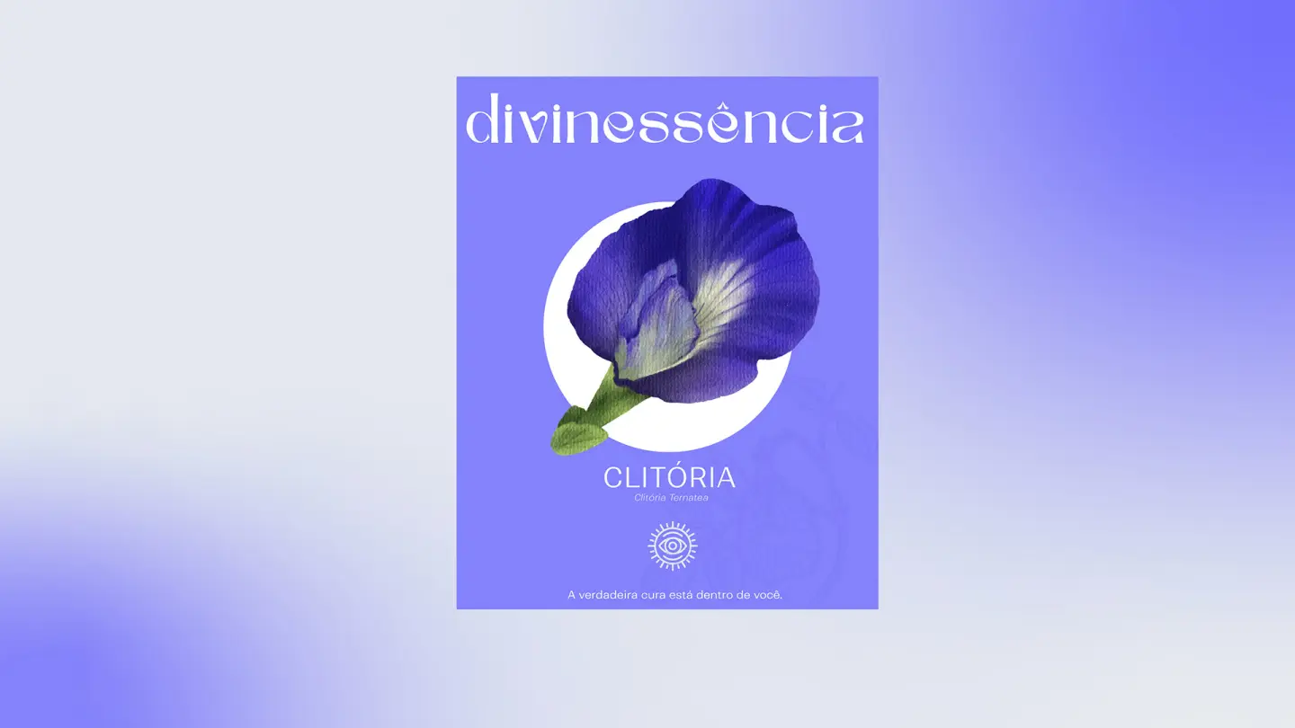
DIVINESSENCIA's visual identity was carefully built to reflect the unique essence of the brand, which specializes in teas made from Clitoria Ternatea, known as blue butterfly. The colors were taken directly from the plant's purple petals and, through in-depth technical analysis in Adobe Color, expanded into analogous, monochromatic, triadic and shade compositions, resulting in a harmonious, striking palette. The typography was chosen to translate the brand's identity with elegance and subtlety, while an auxiliary typeface, with weight variations, offers versatility and dynamism, ensuring efficiency across digital and print applications. Developing this brand was an honor and a significant responsibility, uniting aesthetics and purpose in a visual solution that celebrates the connection between nature, innovation and well-being.