All work 01 Visual Identity
APÉ ETÉ

The brand and website developed for Apé Eté start from the challenge of translating, into verbal identity and digital experience, more than 20 years of observing schools from the inside out — from the construction site to approvals, from coordination to site management — into a brand of its own, with methodology, tone of voice and digital presence built from the first stroke.
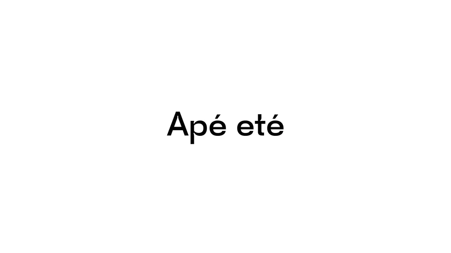
Apé Eté
More than presenting architecture services, the project takes on the job of selling a change in behavior: convincing managers of educational institutions — who often have underused property and no certainty about where to invest first — that the right decision comes before the drawing, and the drawing comes before the build.
The brand starts from a strategic decision: leave the generic territory of the "architecture office" — a commodity, quoted by the square meter, with no competitive defense — for the territory of strategic consultancy for educational spaces, where investigation, diagnosis and feasibility move in clear, reversible stages, and the client can stop at any point with a well-founded decision in hand.

The system develops on parallel fronts
Brand & Name
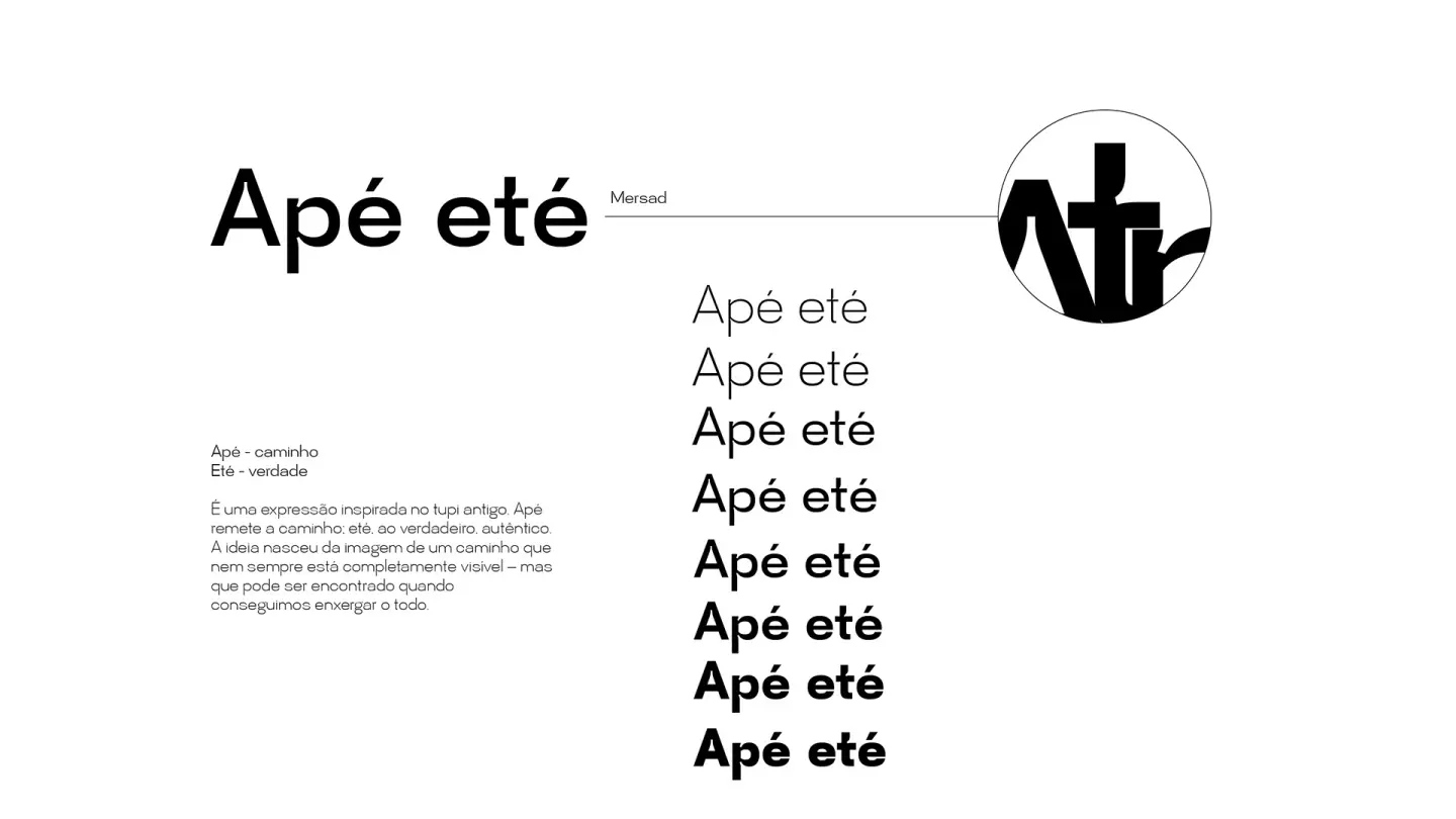
a name with Tupi roots — apé evoking path, eté something true, one's own — worked as the brand's central thesis: there is a right path between the space as it is and the space as it could be, and Apé Eté exists to show it. Calm, technical, direct tone of voice; verbal identity built on ternary structures — "before drawing, you need to look. Before investing, you need to understand. Before building, you need to decide."
Methodology & Service
the working process translated into a five-stage journey — Investigate, Diagnose, Assess Feasibility, Design, Manage — designed so the first three already deliver, on their own, a complete decision, and the last two only come in "if it makes sense". The 01–05 numbering works as the narrative backbone of the whole site.

Web development
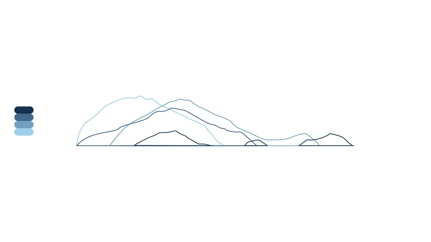
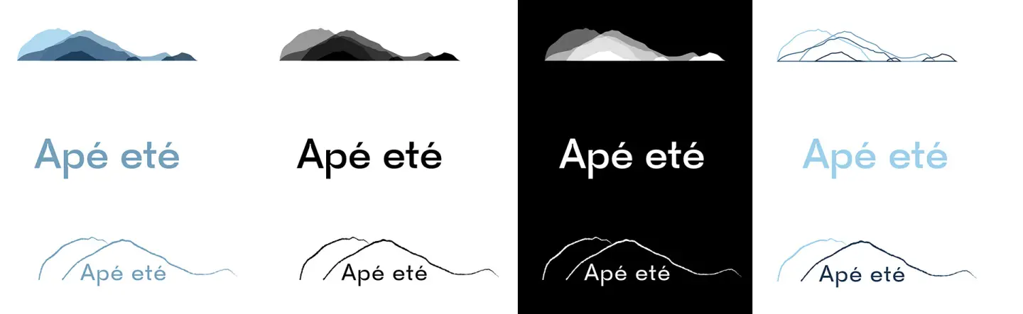
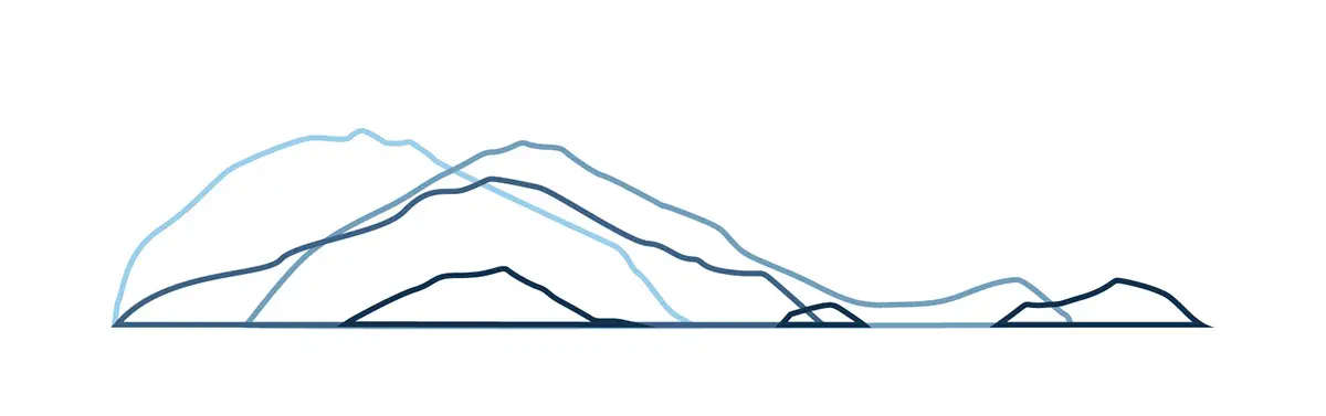
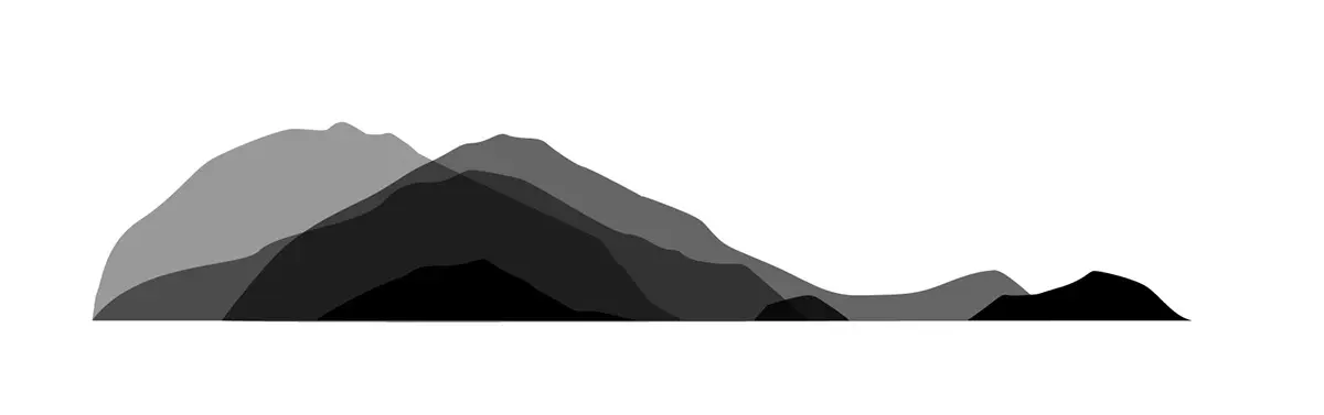
a single-scroll site (apeete.com.br), structured in six sections anchored by a fixed side navigation — Olhar, O que fazemos, Serviços, Quem, Cases, Contato (Look, What we do, Services, Who, Cases, Contact) — that lights up as the visitor moves down. A landscape of mountains in blue gradient unfolds in layers along the scroll, a visual metaphor of the method itself: layers that only reveal themselves to those who look closely. The contact flow was simplified to WhatsApp, prioritizing direct conversation with the client over the friction of a traditional form.
Social proof & Cases
a showcase of real projects — Colégio Arquidiocesano, Maple Bear Pompéia, Escola Acácias, Escola Alef Peretz — categorized by type of intervention (renovation, renovation and expansion, retrofit), reinforcing that the methodology was tested in real schools before becoming a brand product.
The result is a brand designed to be convincing twice: first to the school manager, as the safest path before any build; then to the market, as proof that technical diagnosis, brand language and digital presence can — and should — move together from day zero.